Apartments in the style of minimalism - 120 photos of unusual ideas in the interior
The combination of sophistication and simplicity, elegance and geometric rigor of forms is what minimalism represents. Such an interior solution may appeal to completely different people.
What are the main features of the design of an apartment in the style of minimalism?
This popular style was born in the 1970s. At that time, pop art was ubiquitous, with bright, flashy colors.
For the public tired of the riot of colors, a completely new style has become a breath of fresh air. As soon as it appeared, minimalism gained popularity both in architectural projects and in interior design.
The fashion for this trend captured the United States, after which it began to spread in South America and Europe.
Expressive colors faded into the background, giving way to soft light shades, clearly marked shapes and lines. Indoors must be present empty space and good lighting.
Despite the lack of piling up of details and obvious simplicity, in reality, minimalism in the interior of the apartment is subject to certain rules. Creating such a design, the specialist is obliged to take into account all the little things, to work out a clear structure.
The fundamental elements of style
Rectangular shapes, straight lines of objects immediately attract attention. In a special way, the built space gives rest to tired eyes. Few people can remain indifferent, being in such a room. The design is most often used calm clean shades that are associated with rest and relaxation.
Design features of apartments in minimalism
Monochrome color scheme diluted in halftones. Pastel and light shades can be added to the palette.
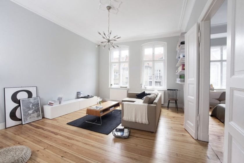
Wall-paper is monophonic. There are no patterns, prints or decorative elements on the walls.
Natural light is welcome, so the apartment should have wide windows. Electric lighting is used according to the idea of the decorator.
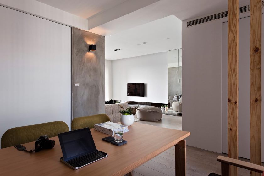
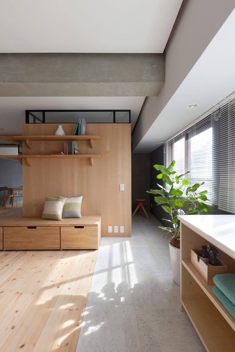
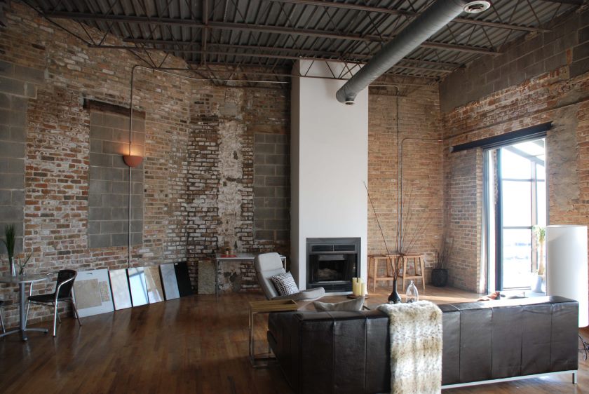
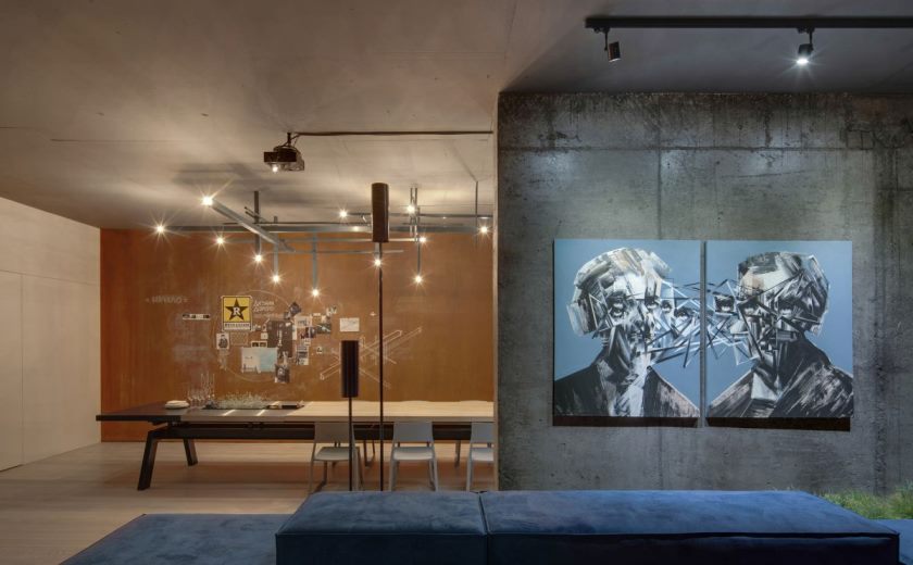
The materials used are very different: from wood to brick. We do not bypass plastic, glass, aluminum and concrete.
Design of different rooms
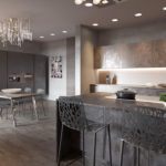
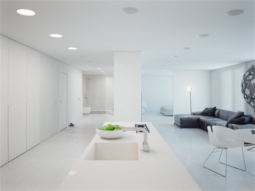
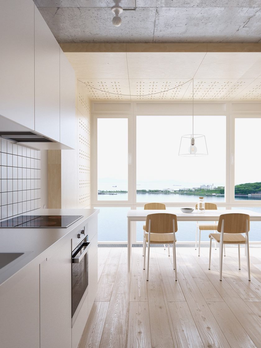
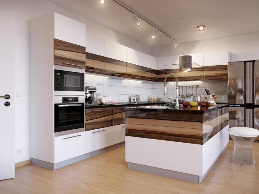
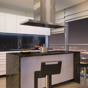
One of the most important rooms in any home is, of course, the kitchen. Very often, it serves not only as a place for cooking, but also as a dining room where we eat. To match style, a kitchen must be a model of perfection.
Divided with the help of light sources, shades, and textures into functional zones, it must contain even smooth surfaces.
It is allowed to use any available materials for decoration. Externally, such a kitchen is close to the hi-tech style.
Perfectly fit into the interior of the lamp, in shape resembling pyramids or made in the form of prisms. It is good to place the backlight not only on the ceiling, but also on the shelves, and even on the floor.
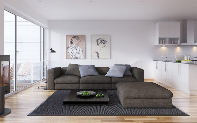
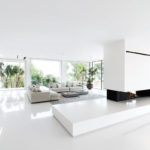
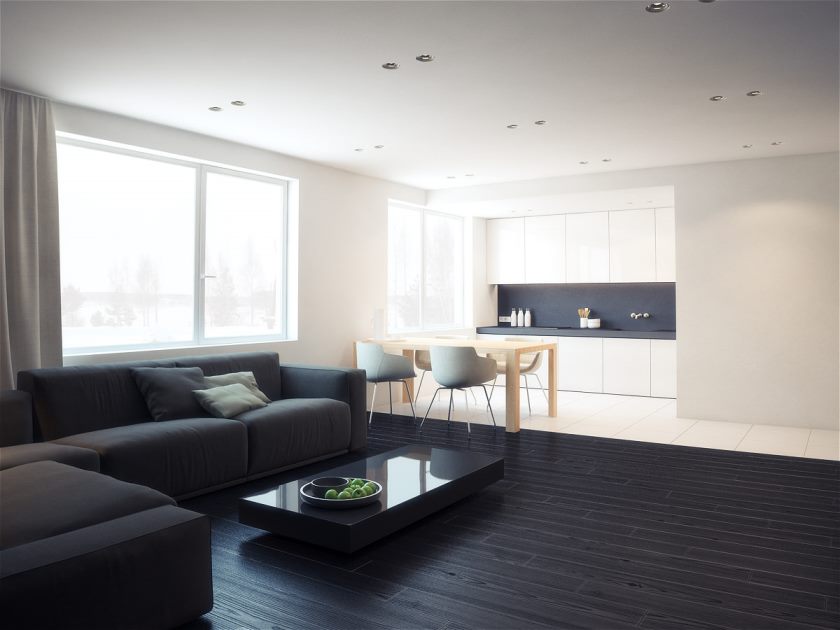
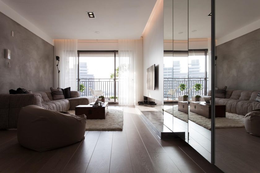
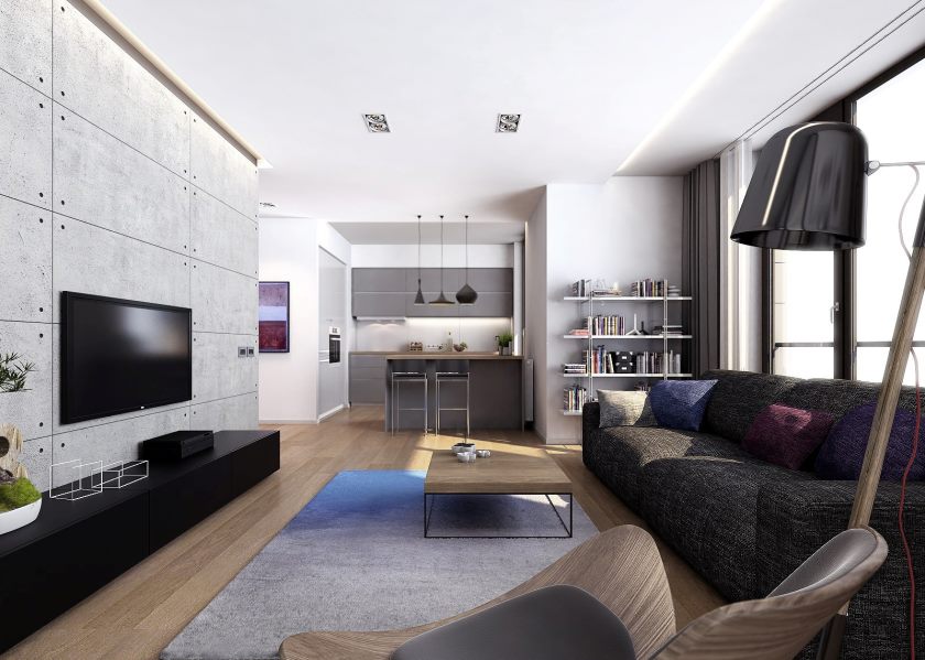
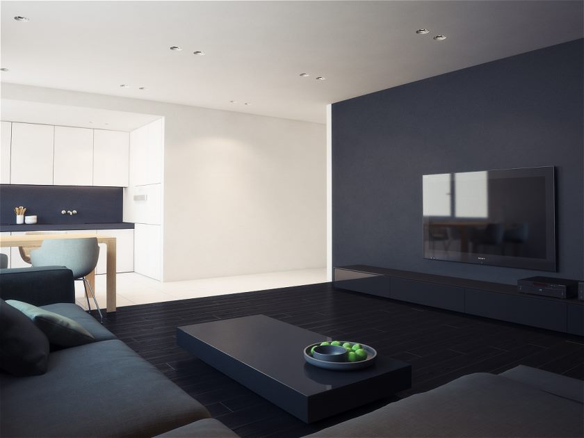
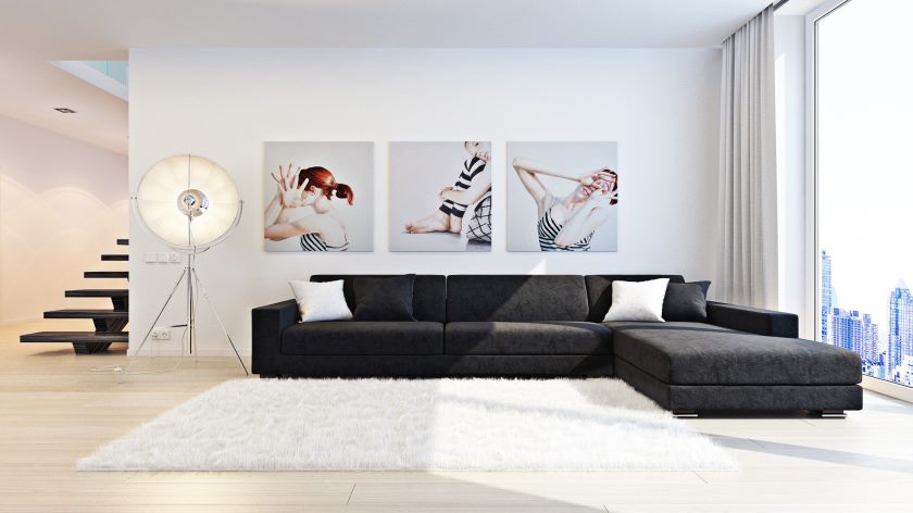
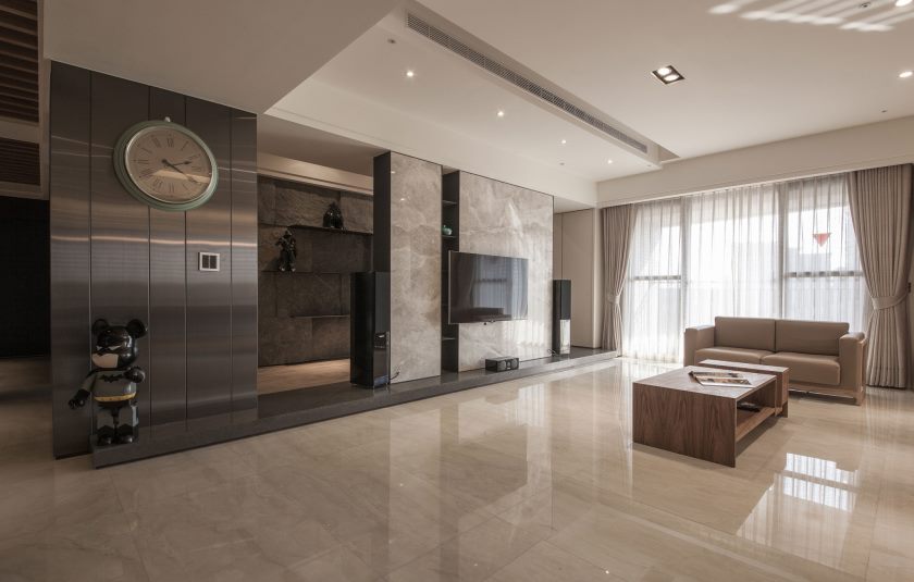
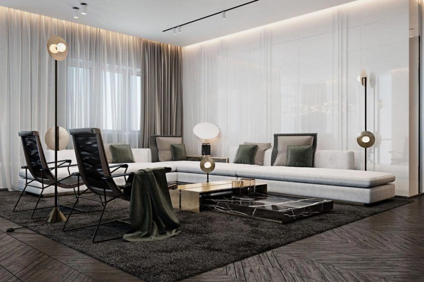
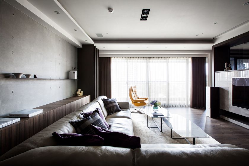
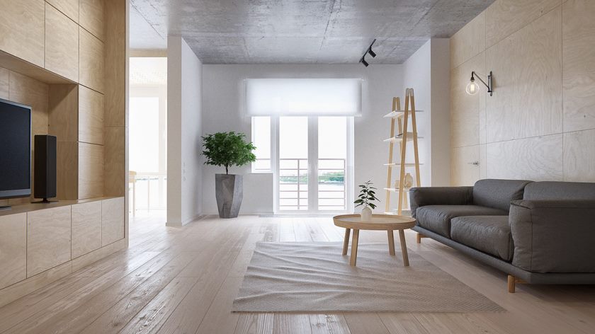
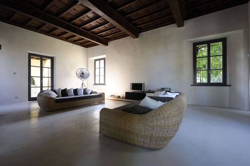
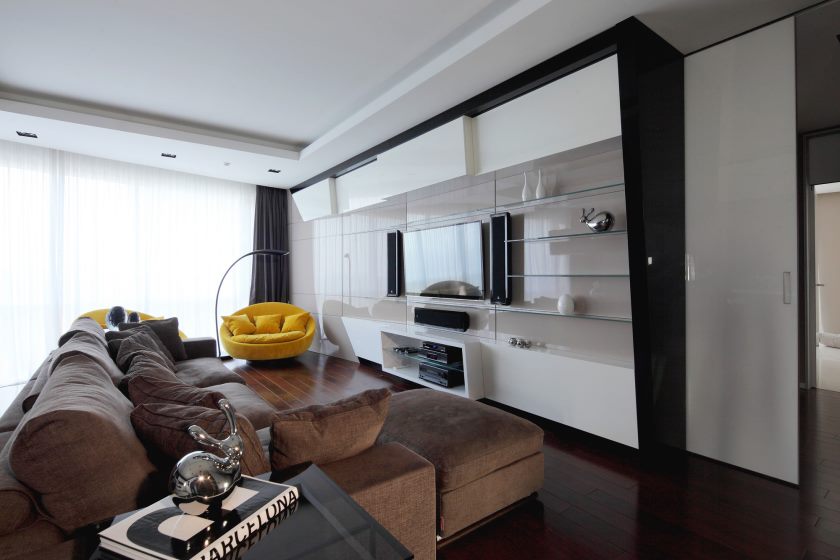
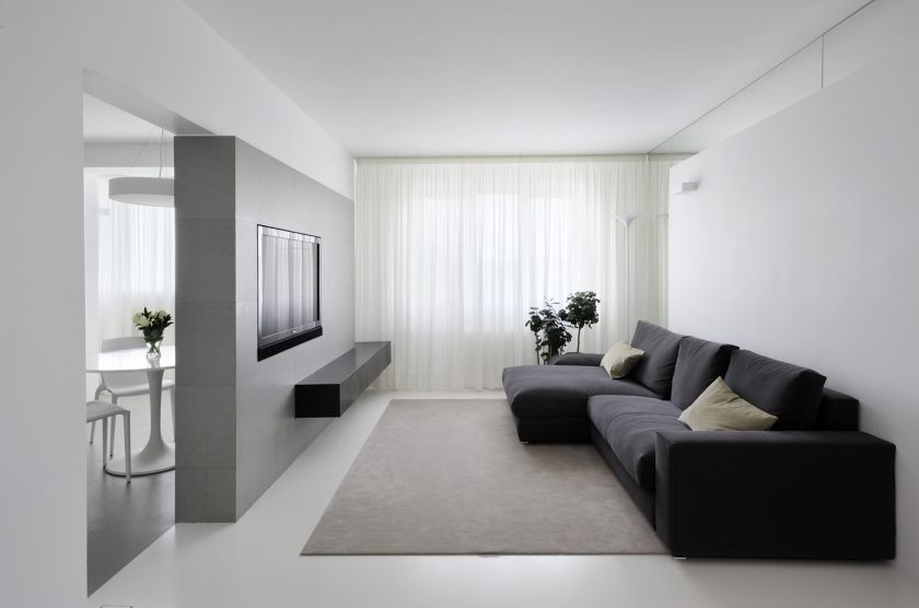
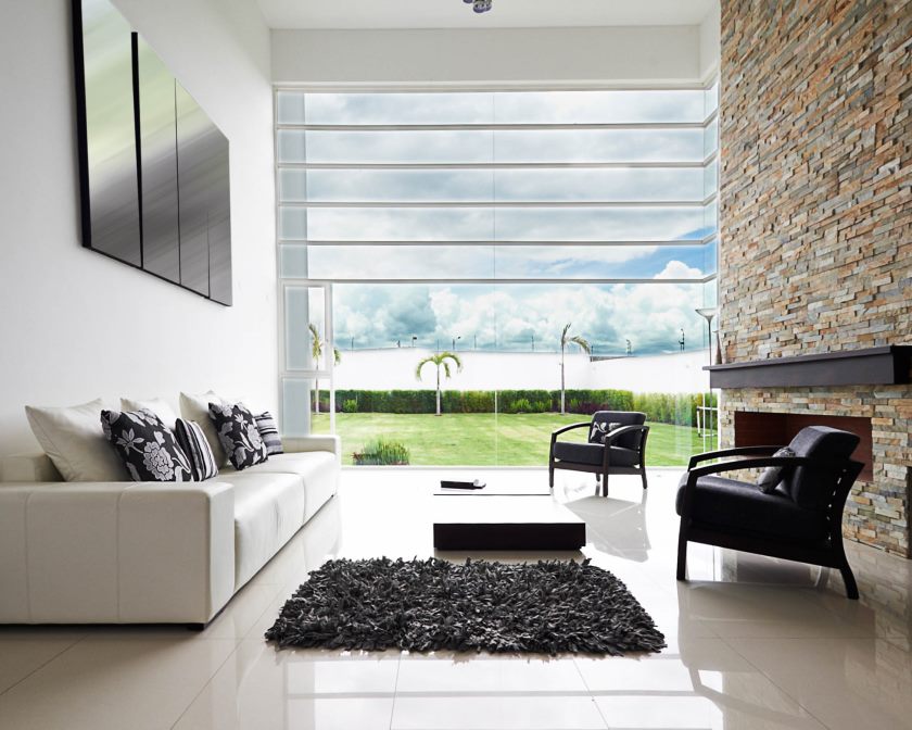
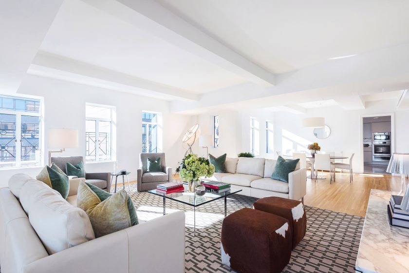
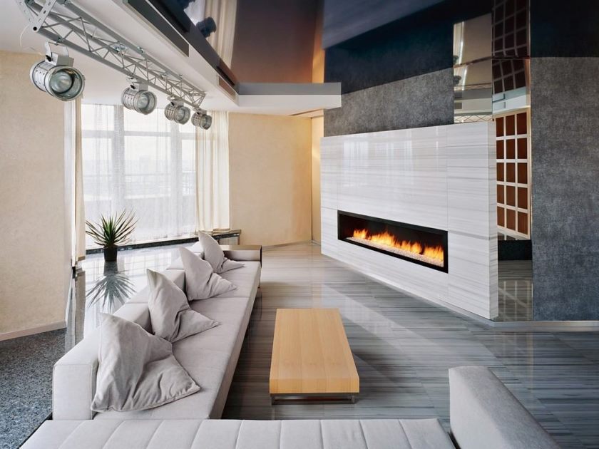
As a rule, in apartments with minimalism used in design, a spacious and bright living room. But even a small space can be visually enlarged using certain tricks. And by combining the living room with other rooms, you will significantly increase its area.
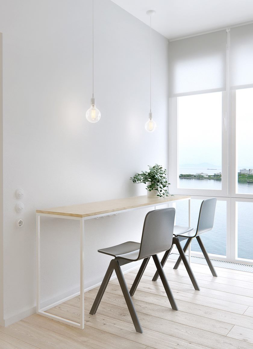
Typical use of long windows, from the floor to the ceiling. They naturally expand the available space when looking. An excellent solution would be to make panoramic windows around the perimeter of the wall. It looks very impressive!
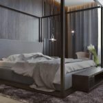
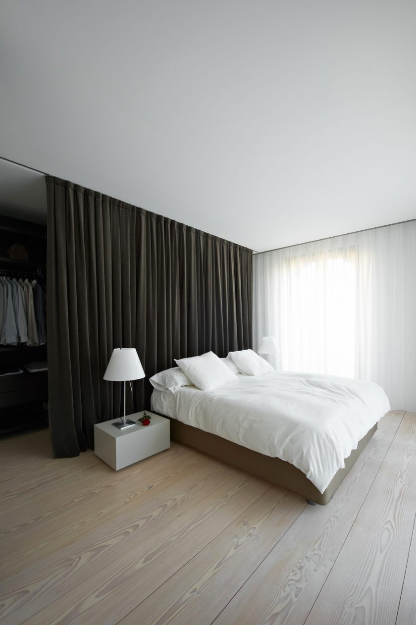
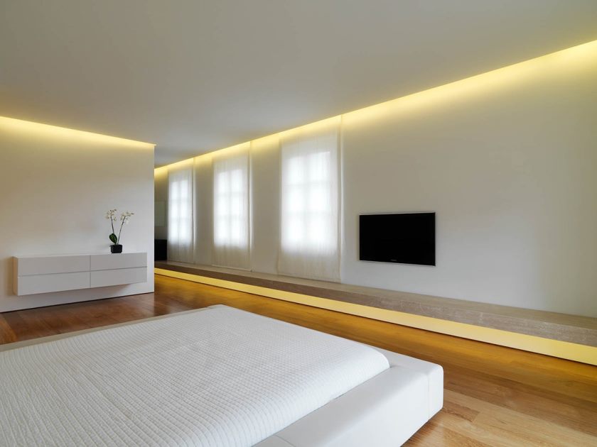
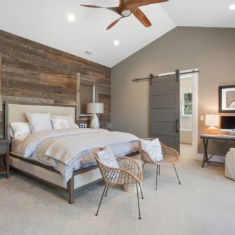
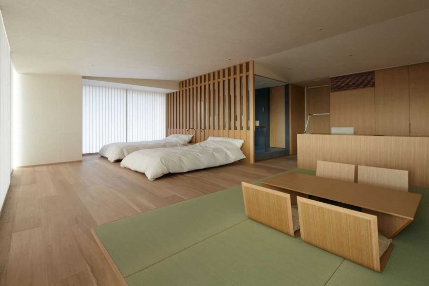
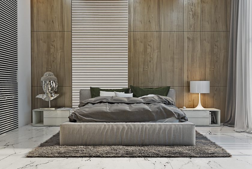
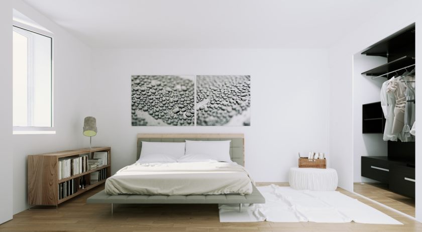
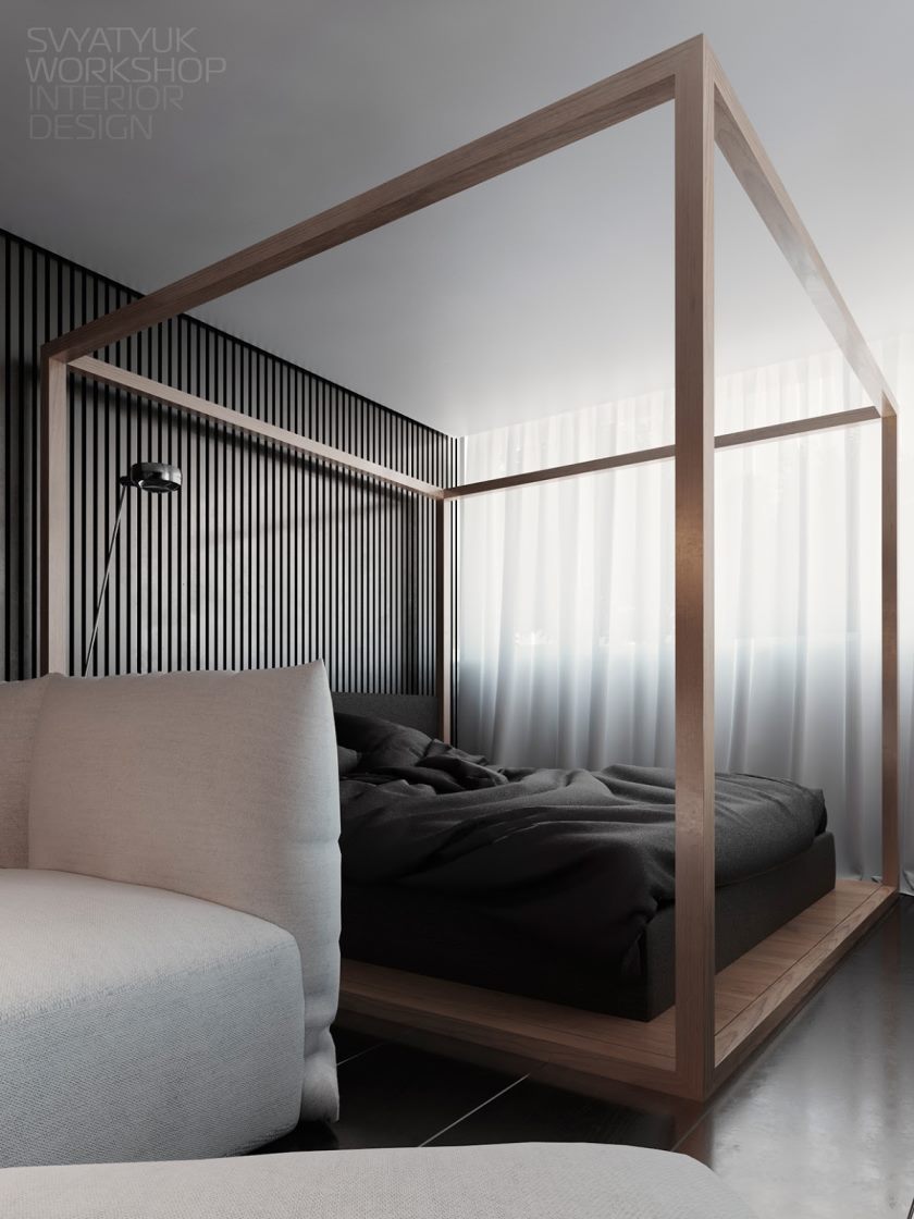
When furnishing a bedroom, do not forget to get rid of unnecessary things to free up space. Unnecessary items are best put in the closet. Do not clutter up the room with extra furniture - only the most necessary. Ideally, only a bed is the center of the whole room.Looks great bed on a small podium or with a canopy.
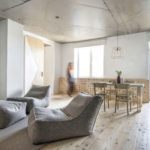
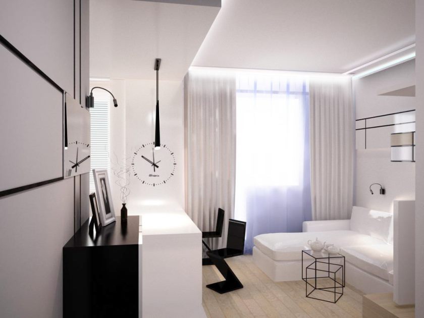
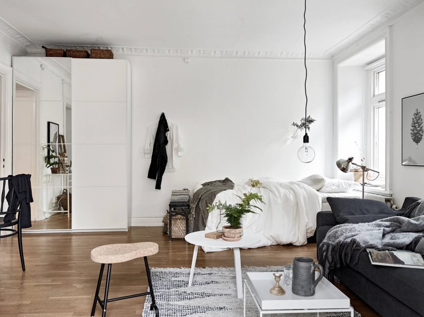
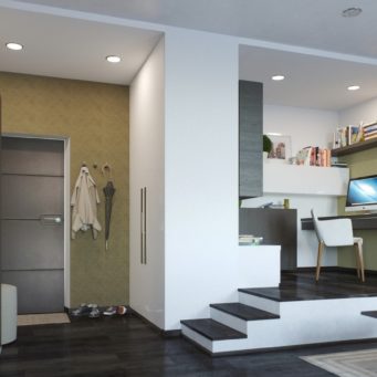
Making minimal studio apartment is also quite realistic. Let everything be in one color range. Emphasize by hanging a small panel or electronic clock on the wall.
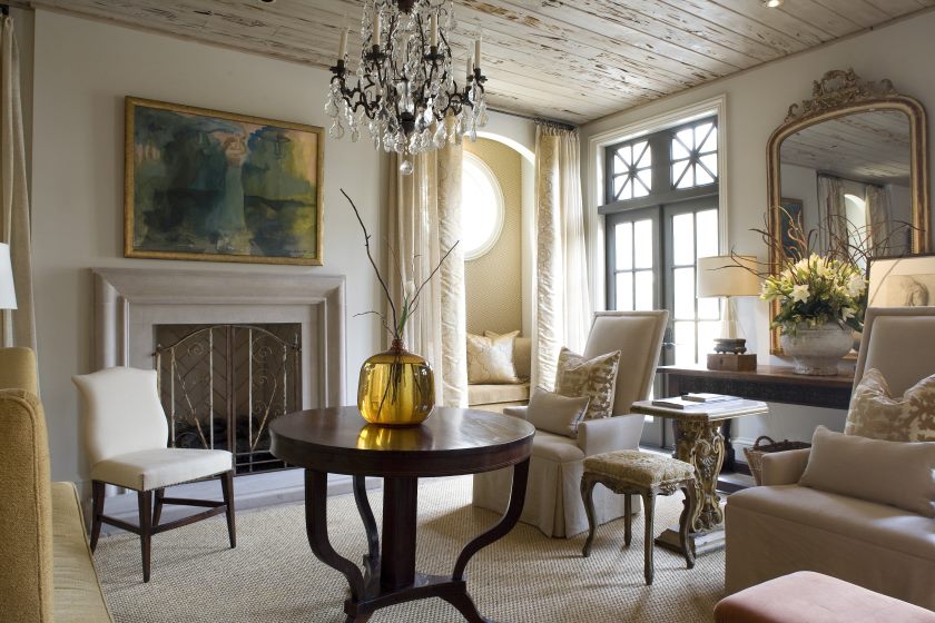
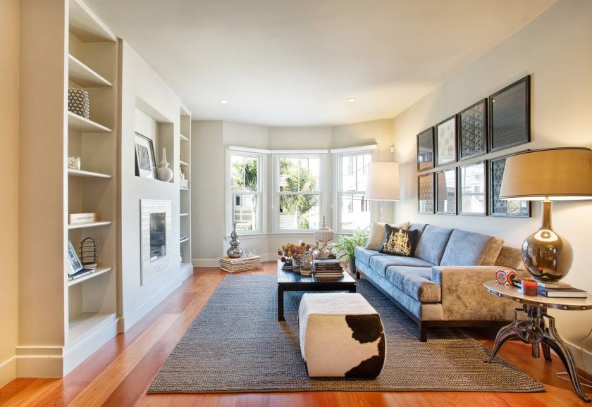
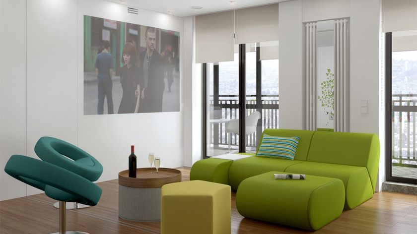
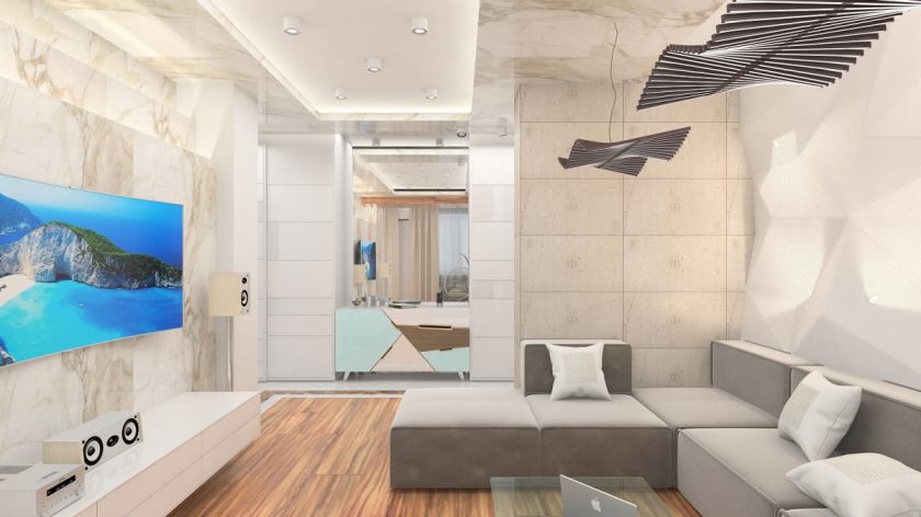
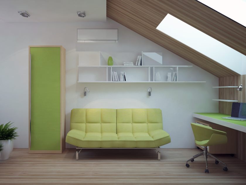
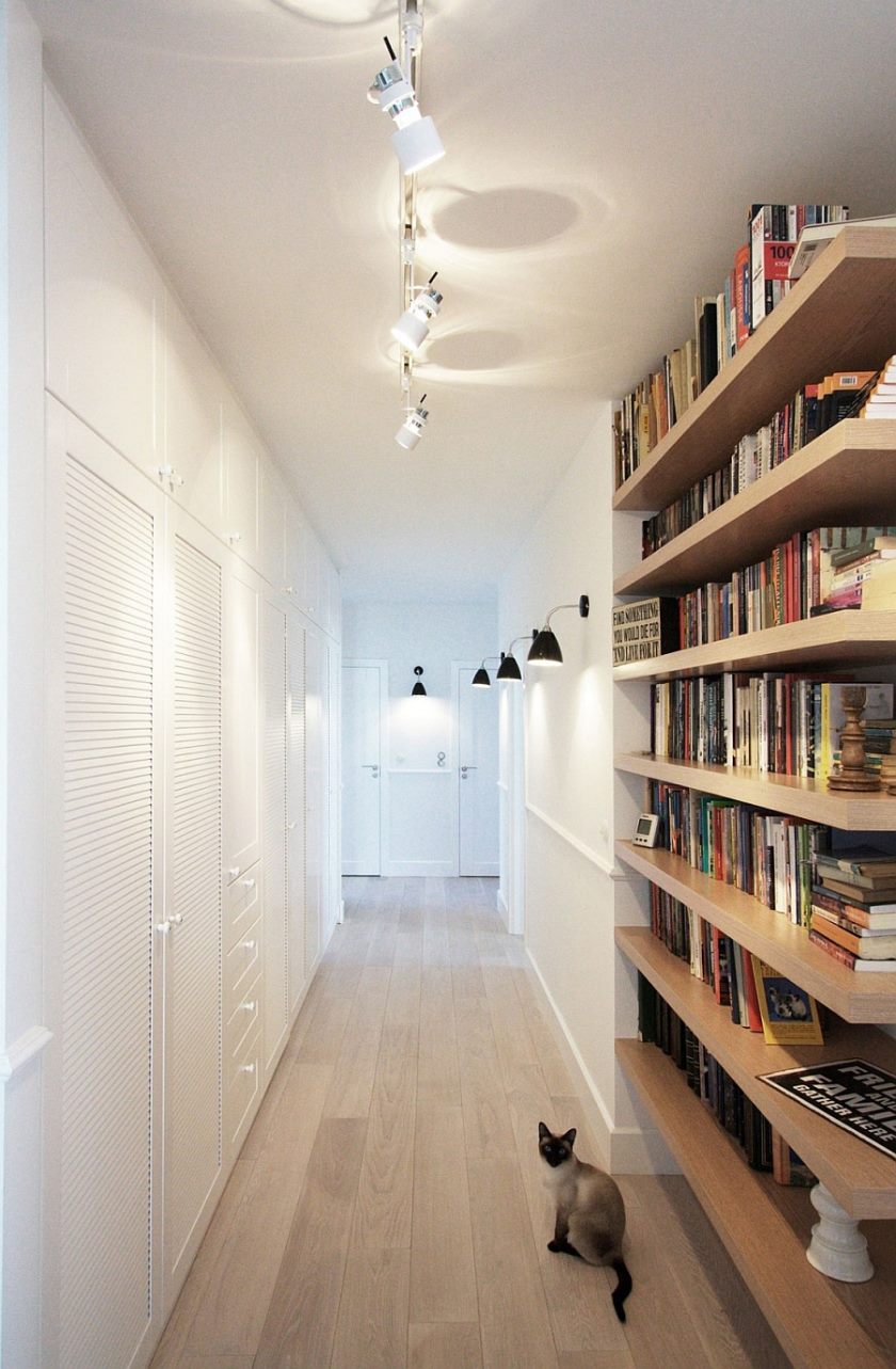
It is good to draw ideas from the existing developments of famous decorators. See more minimalistic design photos to decide on your own interior design.
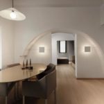
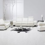
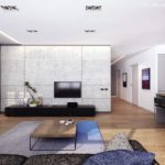
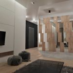
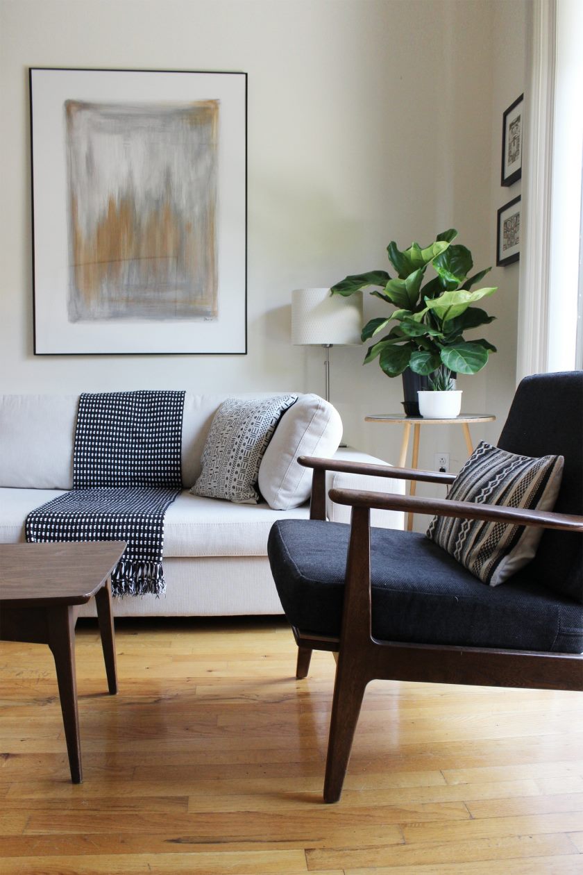
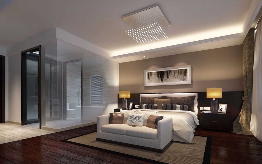
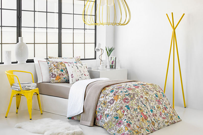
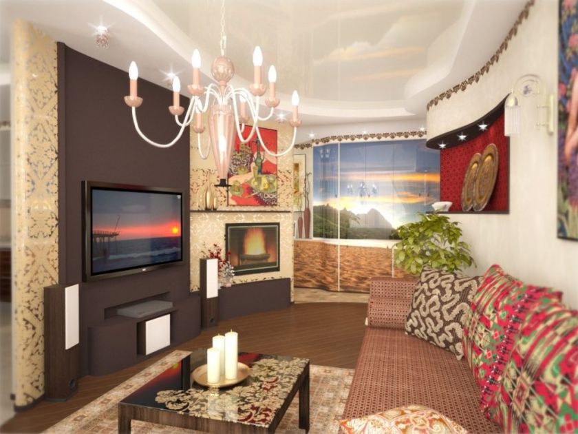


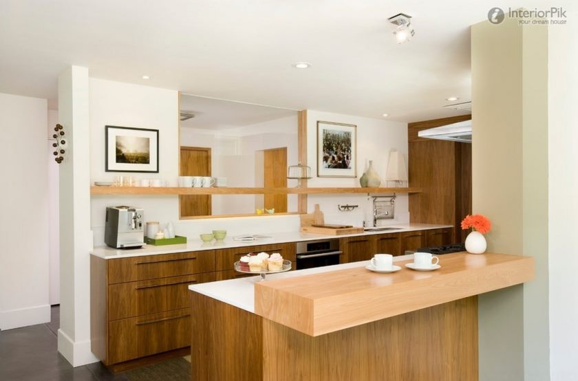
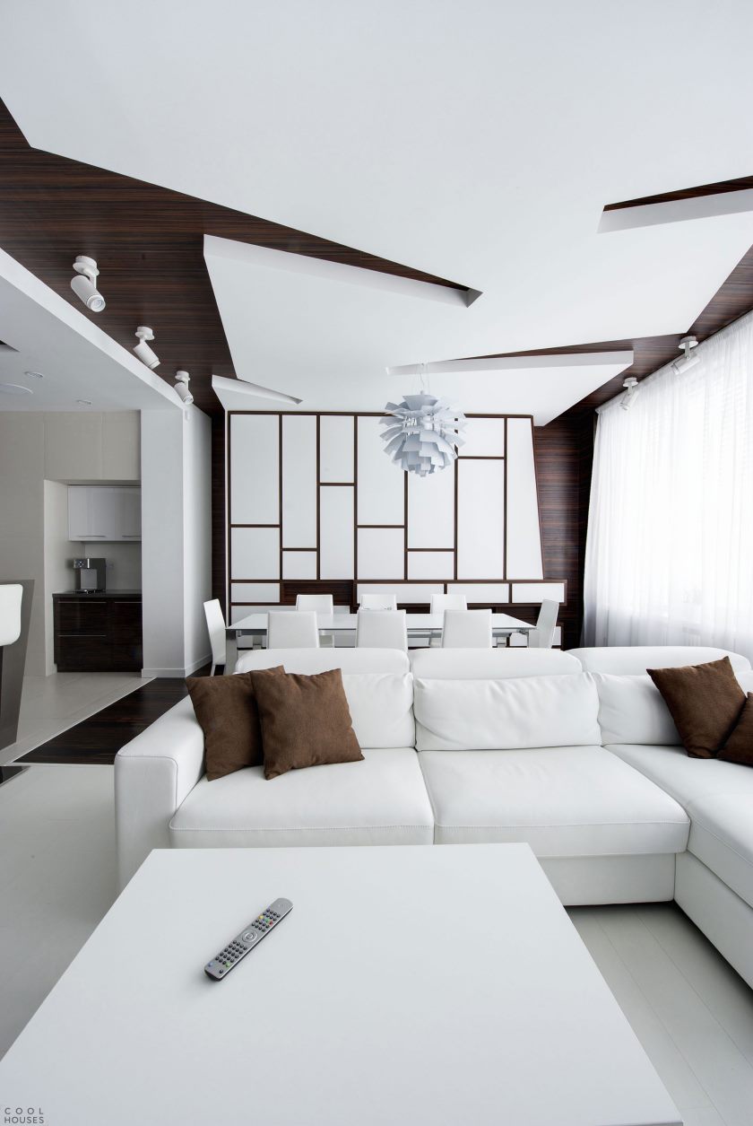
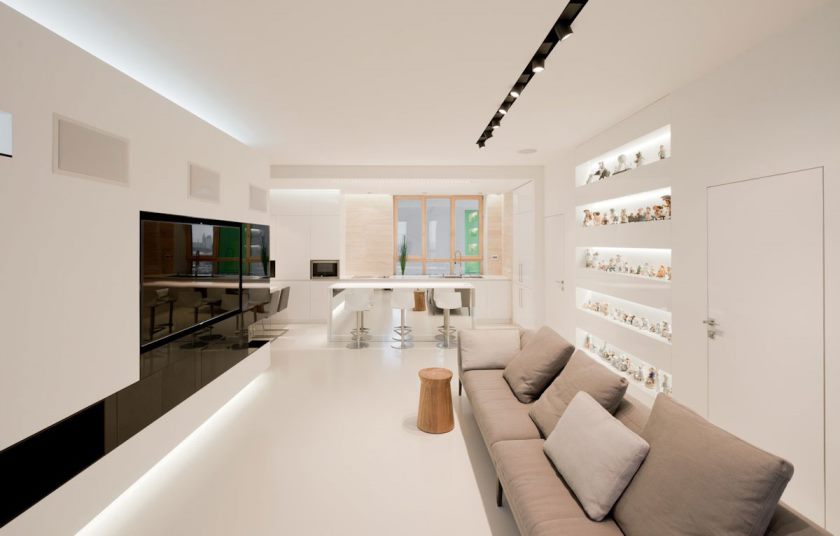

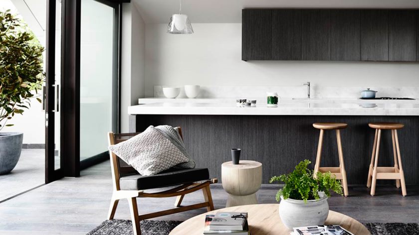
Call these designers to decorate my 60-meter apartment! :) According to the pictures, it seems that they can mostly be deployed only in rooms with half a football field :) In fact, it looks good if you don’t hit the same color or in an uncomfortable range, where strictly
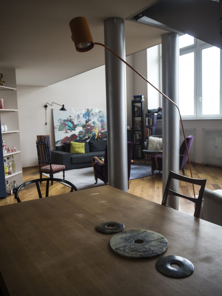
black and white. And some rooms in general in an industrial style - probably for IT residents :) And for some reason there are not enough truly cozy interiors - maybe minimalism and comfort, in principle, are poorly combined?