Living Room Color - 140 photos of perfect color harmony in the interior
With these recommendations, the selection of colors for the interior of the living room will be greatly simplified and will not take much time.

Whatever style is preferred in the design of the living room, the color scheme is of great importance in the design of its interior and design. Of course, now the spectrum of colors is very wide and it is extremely difficult for a simple layman not to get confused and decide on the right choice. But if an independent search is somewhat difficult and has not yielded results, it is recommended to contact specialists in these matters, who will select the option as soon as possible taking into account all your wishes.

The list of questions that will be discussed in detail below:
- Skillful combination of colors
- Colors in high demand in the decoration of the living room
- Zoning by playing with color and other devices
- Recommendations that help to perfectly combine different colors while maintaining a sense of taste and style.

The right selection of colors for the interior of the room is not such an easy task, but with the help of the recommendations below it can be solved as soon as possible.

Skillful combination of colors
All colors are conventionally divided into two types: - cold and warm.

It is very important to consider this point: - If you are doing the design of your living room on your own, then you should not mix both types, it is better to choose the same color line, because these shades are too contrasting.

To combine a warm tone and a cold one, it is necessary so as to prevent a sharp transition in the color scheme, and also so that the combination of colors in the living room looks proportionate - only a professional can do it. It is important to remember that a small percentage of the warm shade when decorating a living room in cold colors will not spoil the overall picture with its presence, but rather add elegance and sophistication to the interior. In the same way, if you use a ruler of warm shades in the color of the walls of the living room, you just need to dilute it with a moderate amount of cold shades. Thus, the harmonious combination of colors in the living room eloquently makes it clear that the owner of this room has a great taste and amazing sense of style

Pay attention to what direction the windows of your living room indicate? Do your windows point south, and is there a lot of sunshine in the room very often? In this case, we choose a line of cold tones, otherwise the feeling of unbearable stuffiness and heat will never leave you, and the existing air conditioning will not save you.

Popular colors for living room decoration
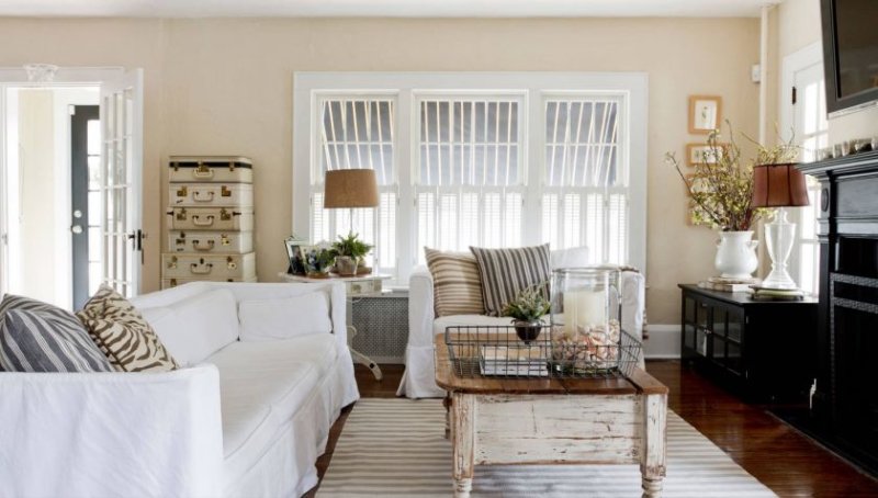
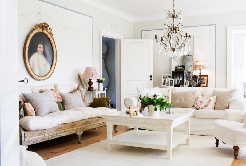
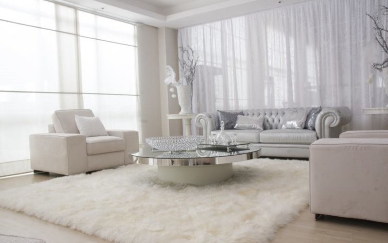
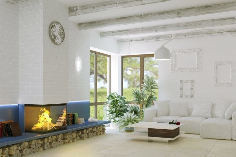
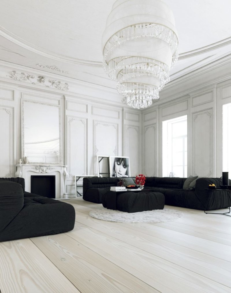
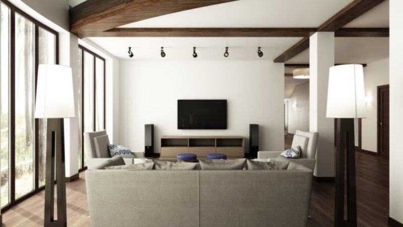
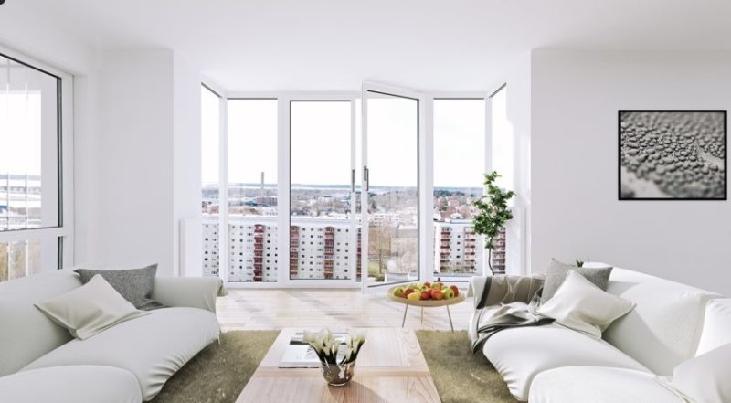
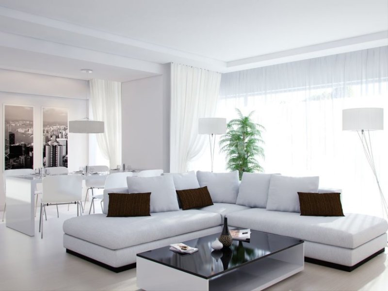
Living room in white - this color must be entered very carefully and in moderation in order to prevent its overabundance, otherwise the feeling that you are in the hospital room will not leave you.

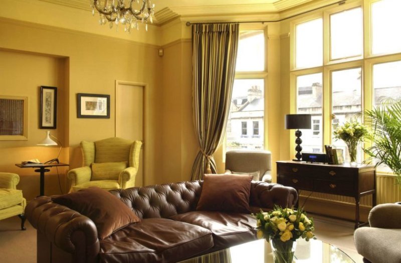
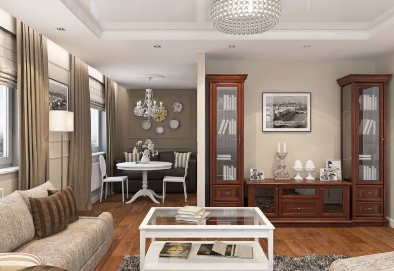
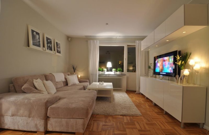
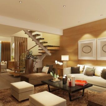
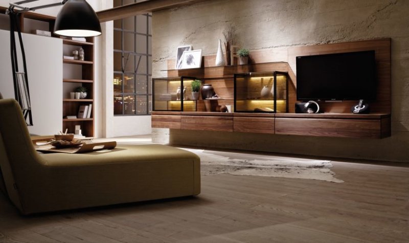
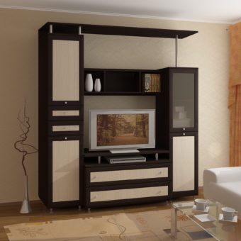
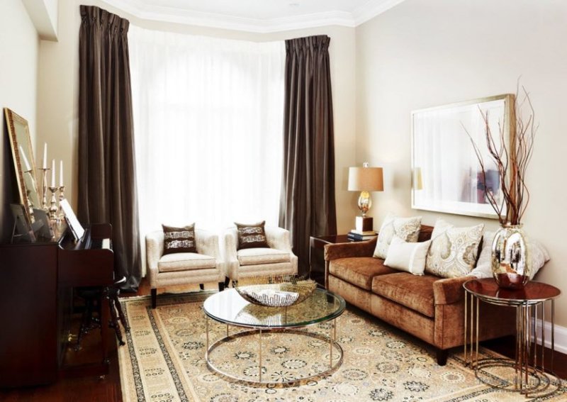
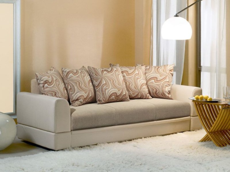
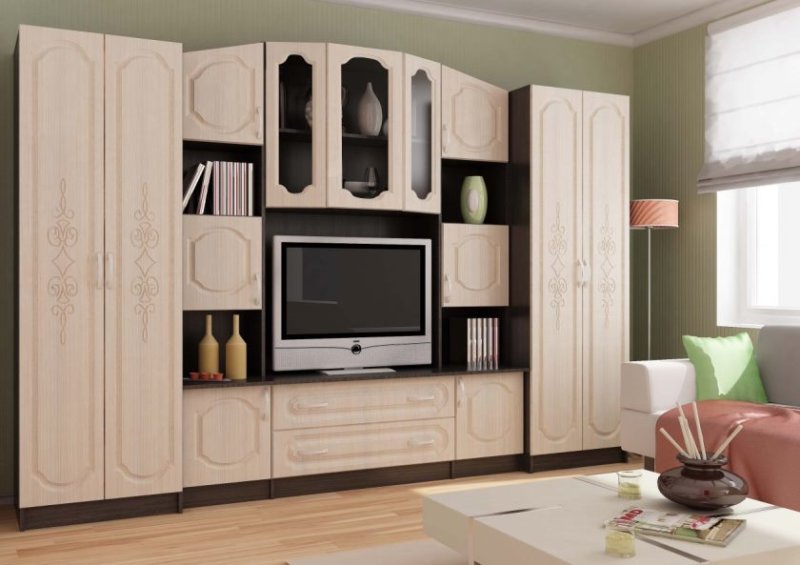
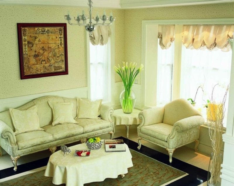
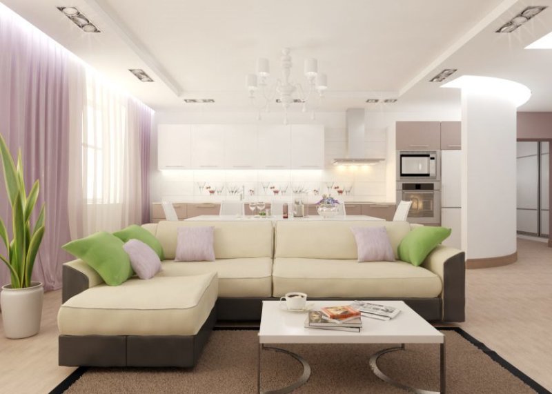
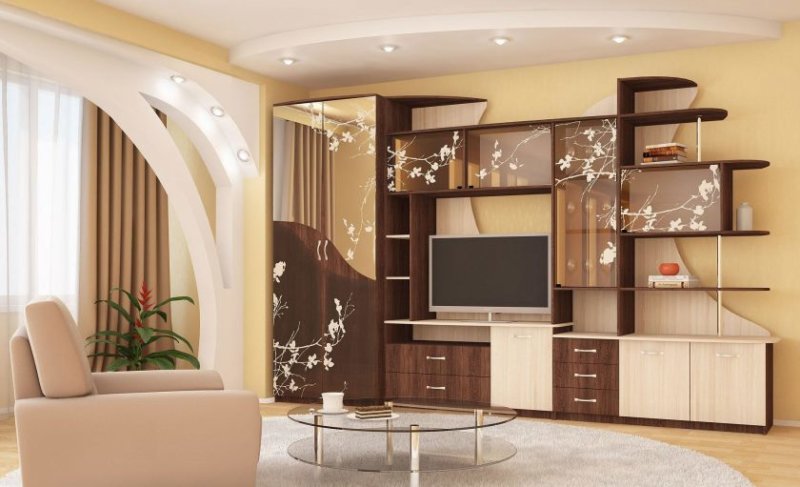
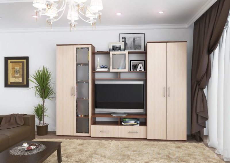
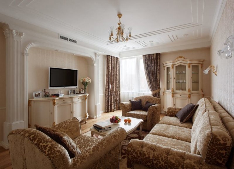
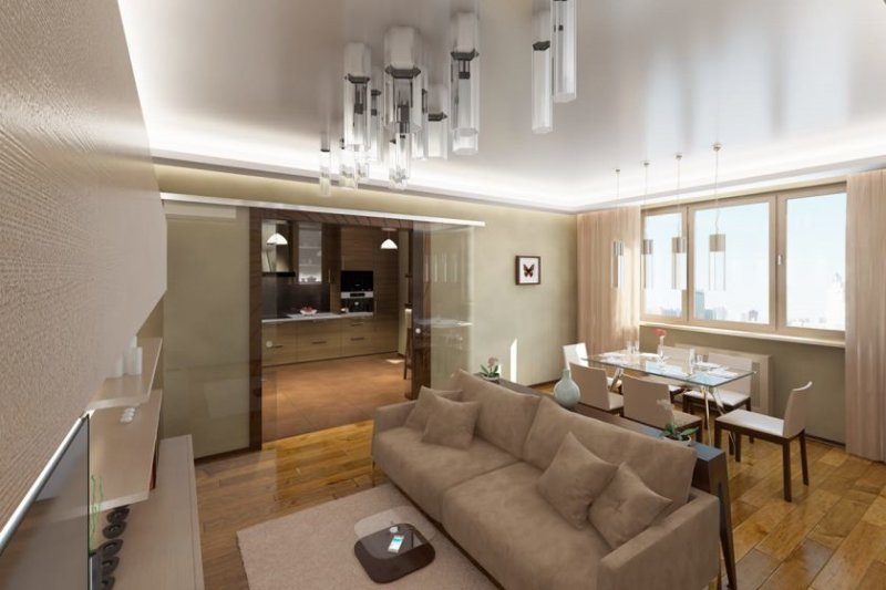
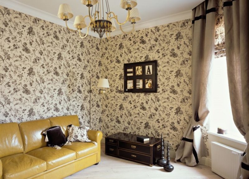
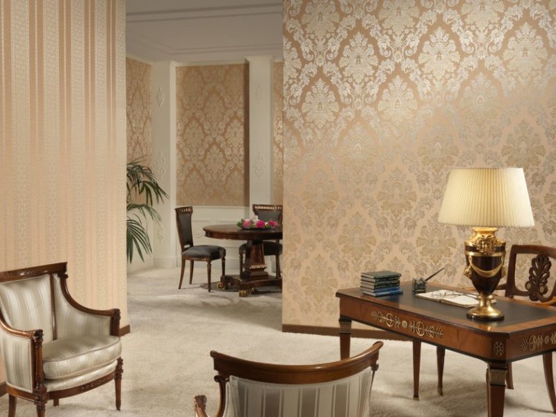
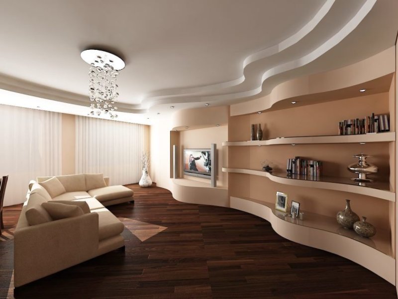
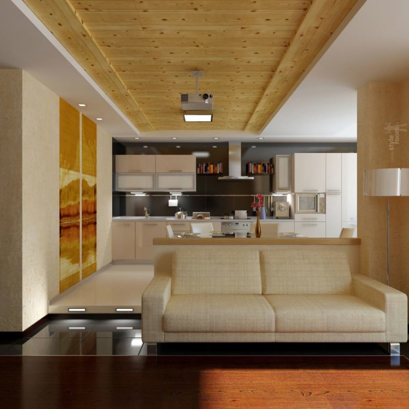
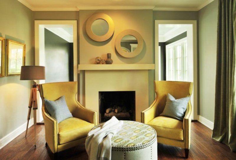
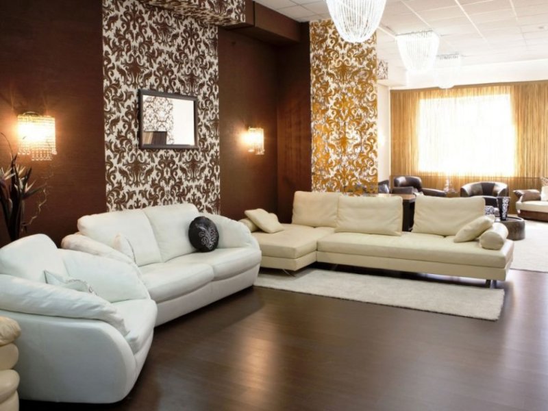
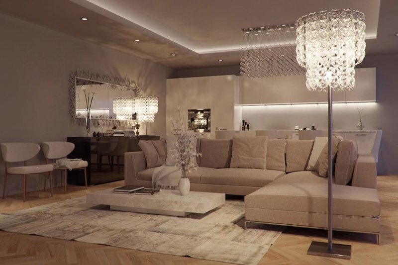
The beige color in the living room as shown in the photo is a very picky color, it’s good that picking up furniture made from wooden materials for it will not be a big deal. Making the color of the walls in the living room in beige is almost the perfect solution.

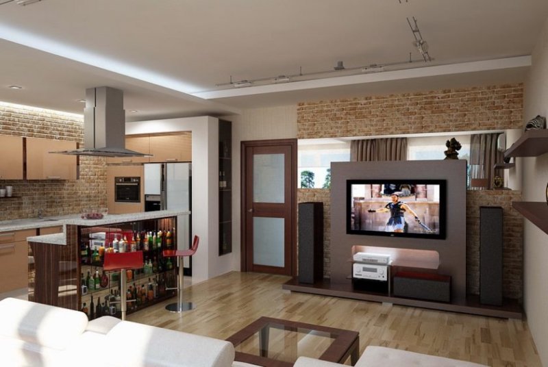
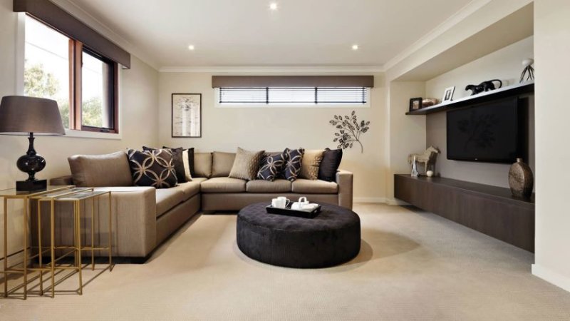
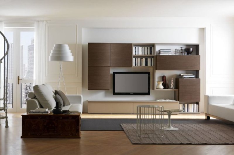
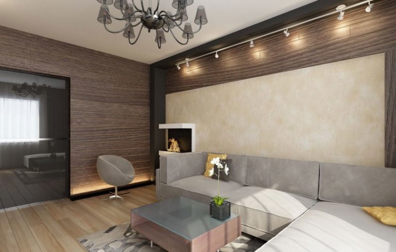
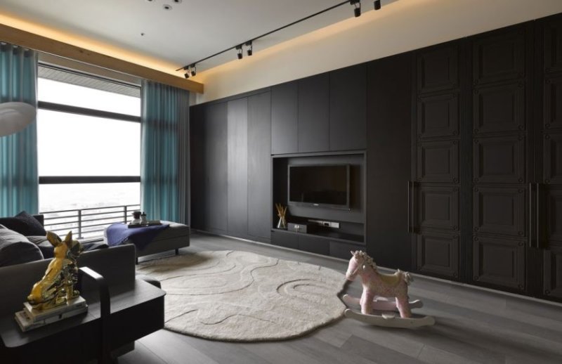
Brown color in the living room - complement the interior with a touch of practicality, but its overabundance is fraught with the merger of the furniture set and the walls together. It also needs to be used in moderation.

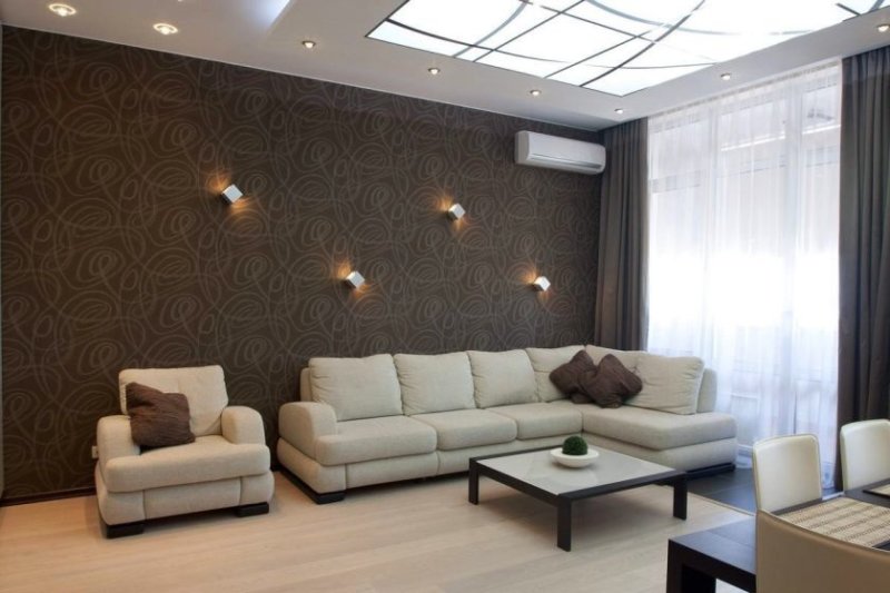
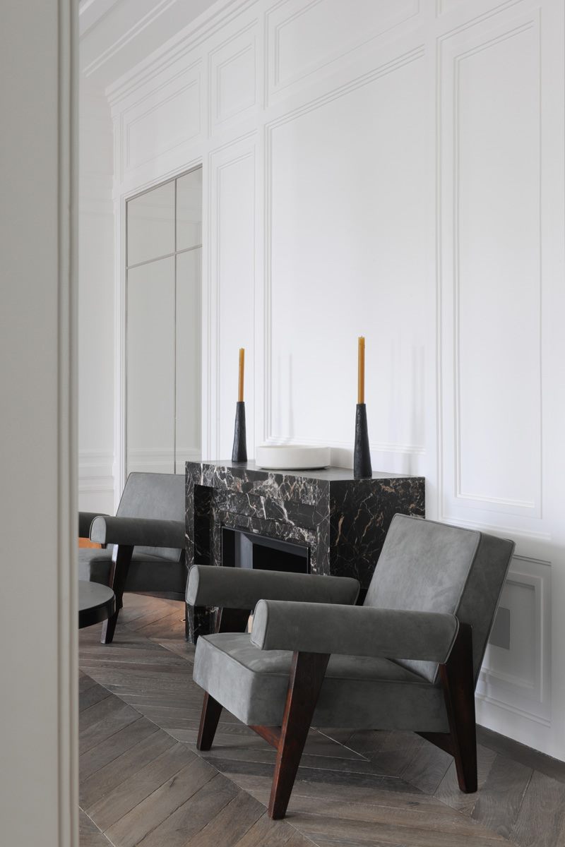
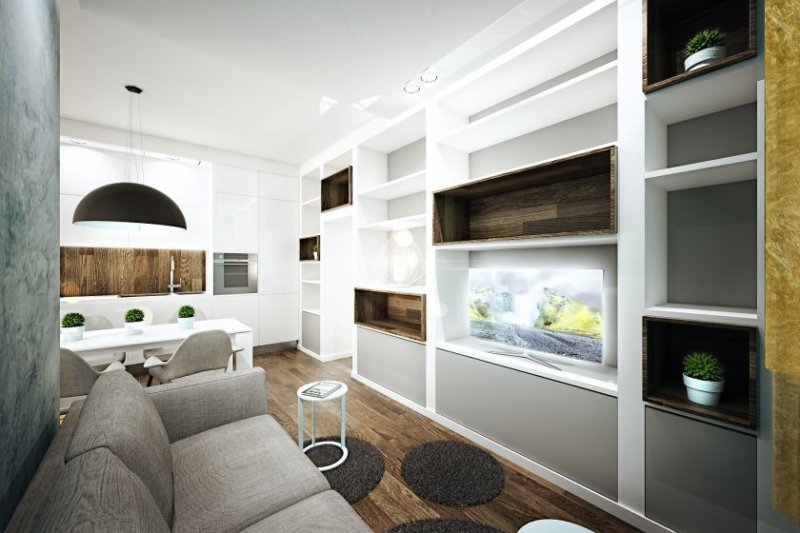
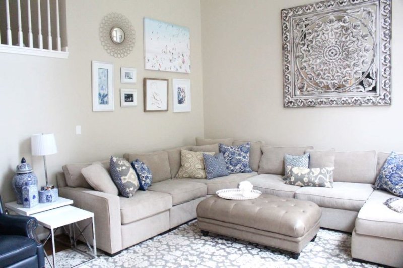
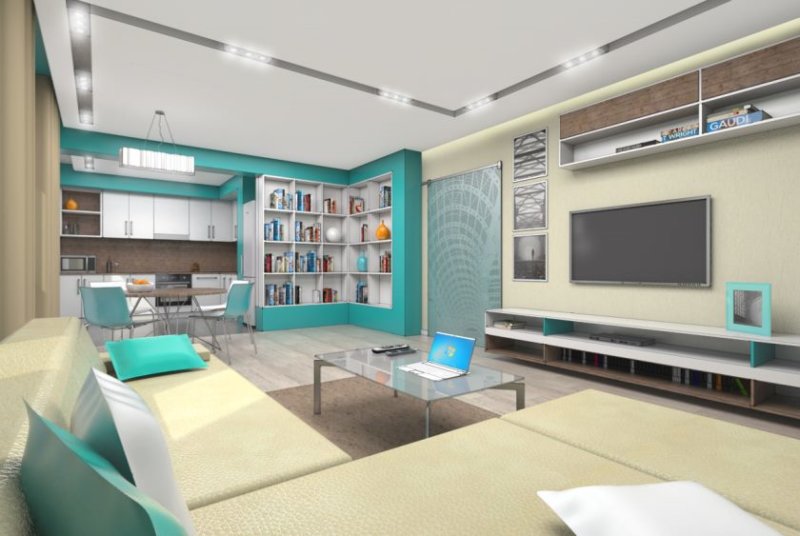
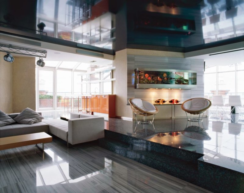
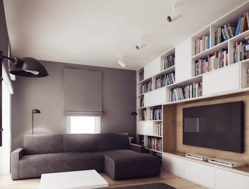
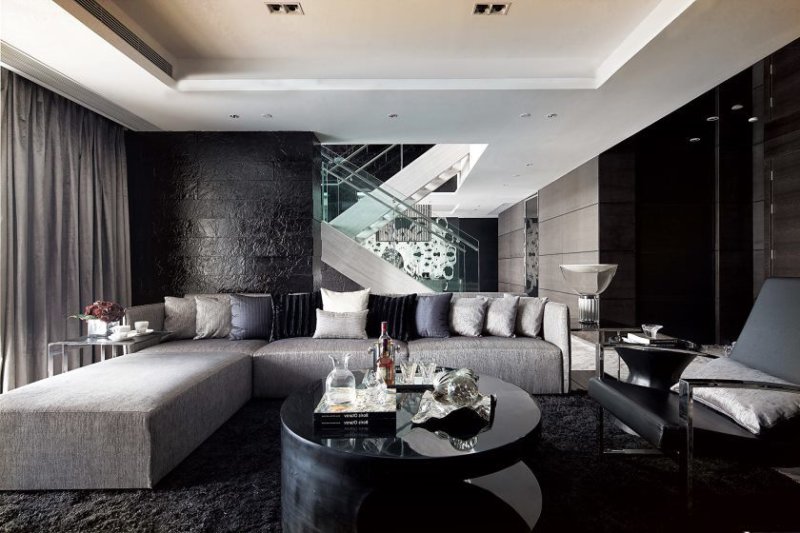
- Gray color - many mistakenly consider this color too dull and boring, but this is not true, it will perfectly fit into the combination of colors in the living room.
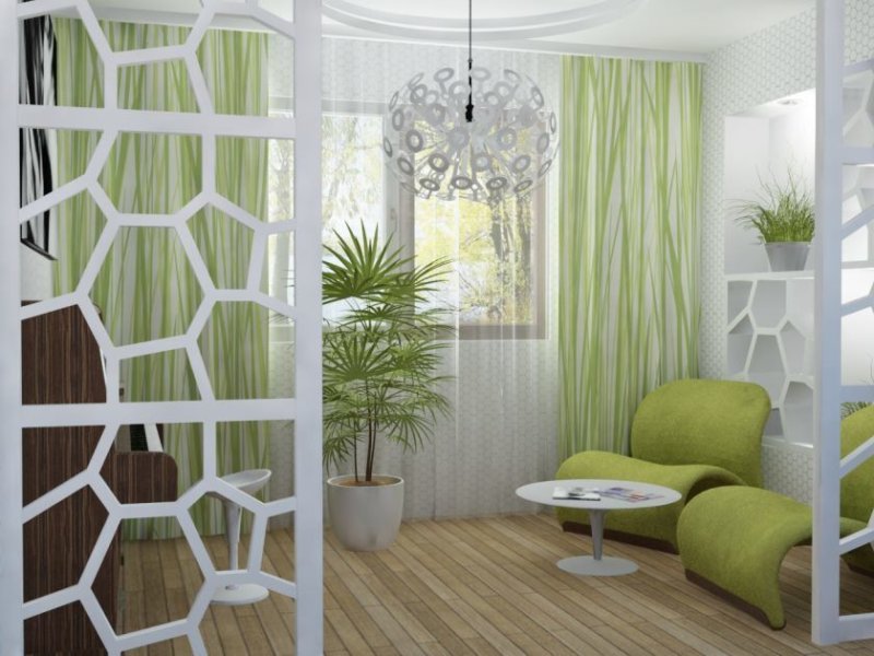
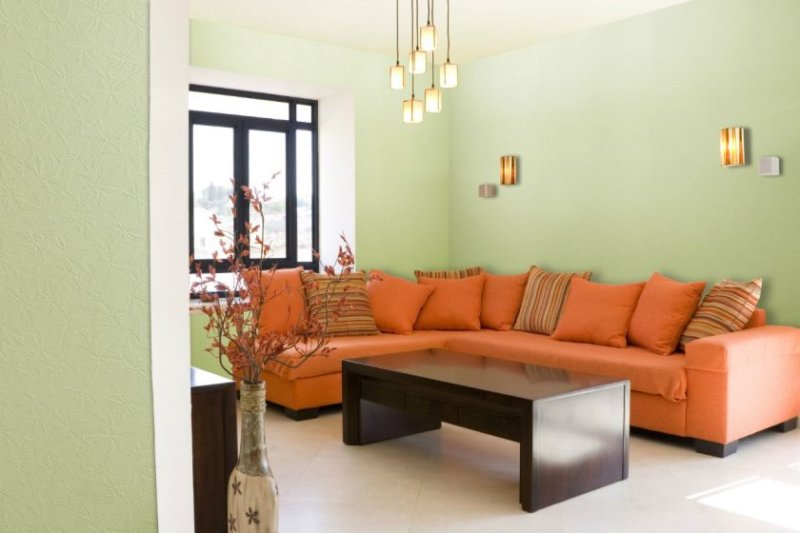
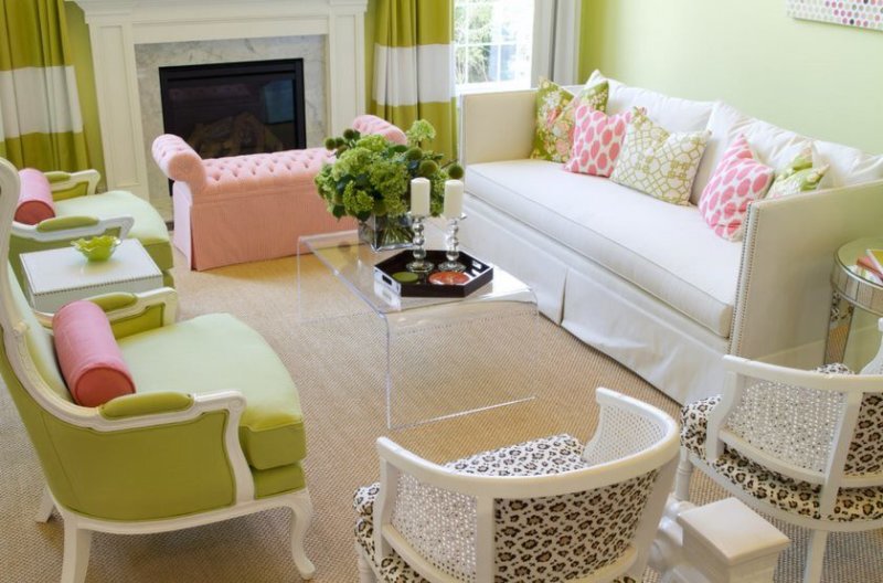
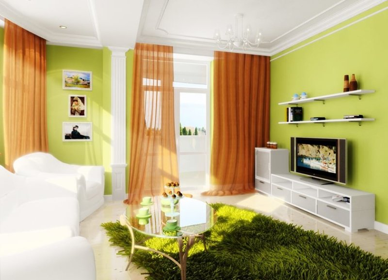
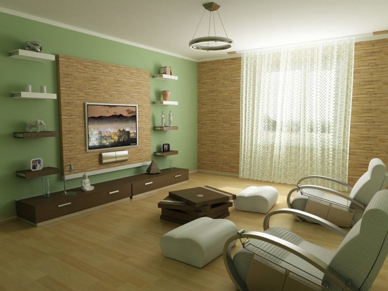
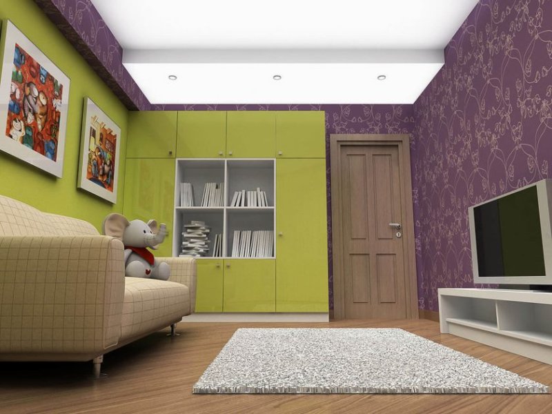
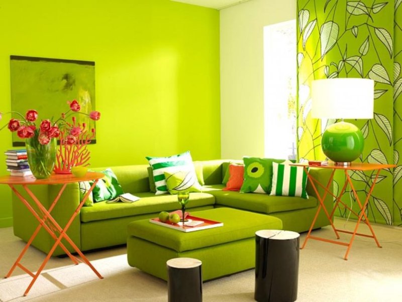
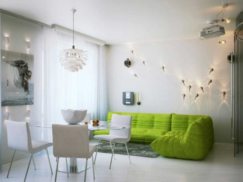
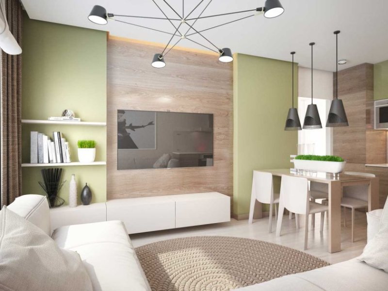
- Green is the perfect color for the walls in the living room if its windows are facing north.
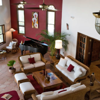
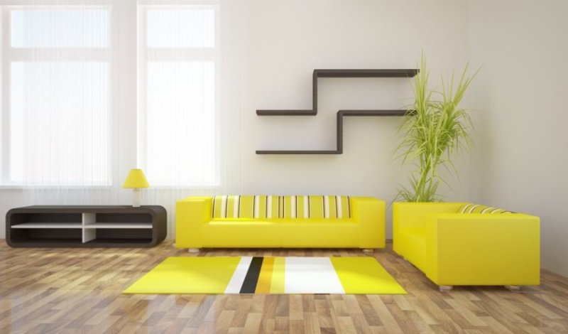
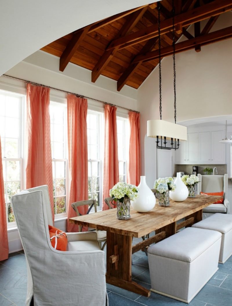
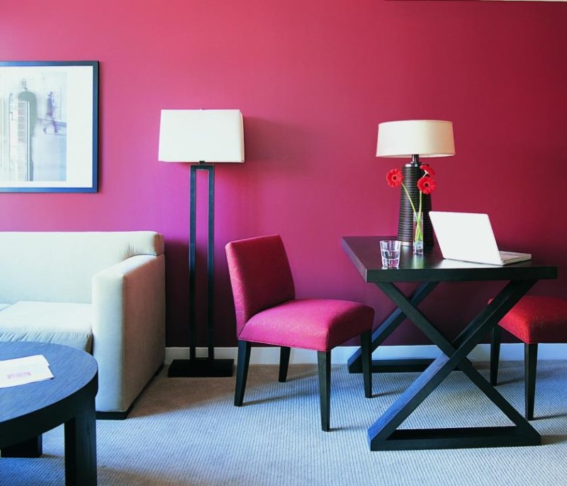
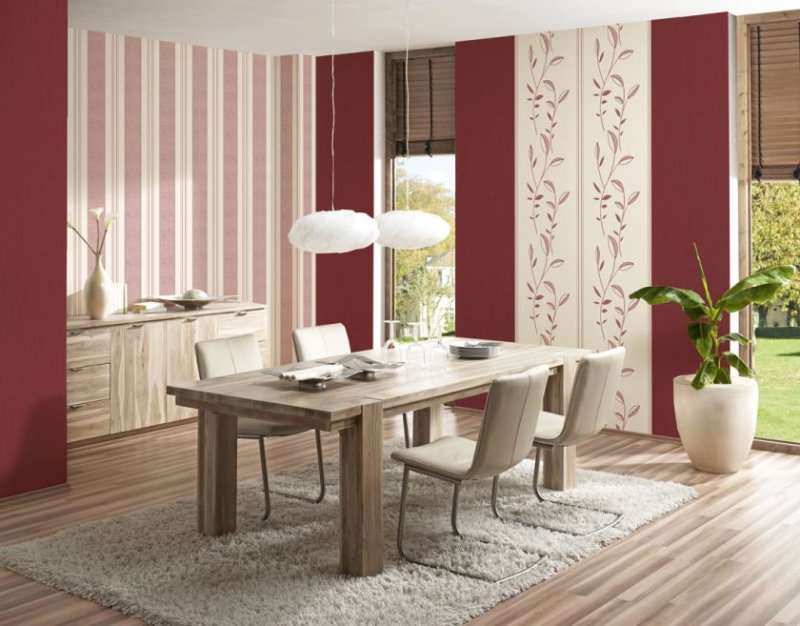
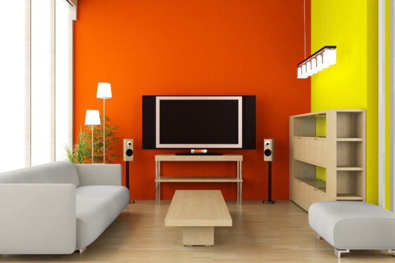
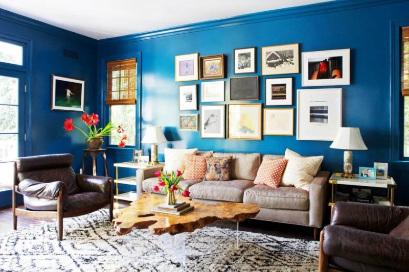
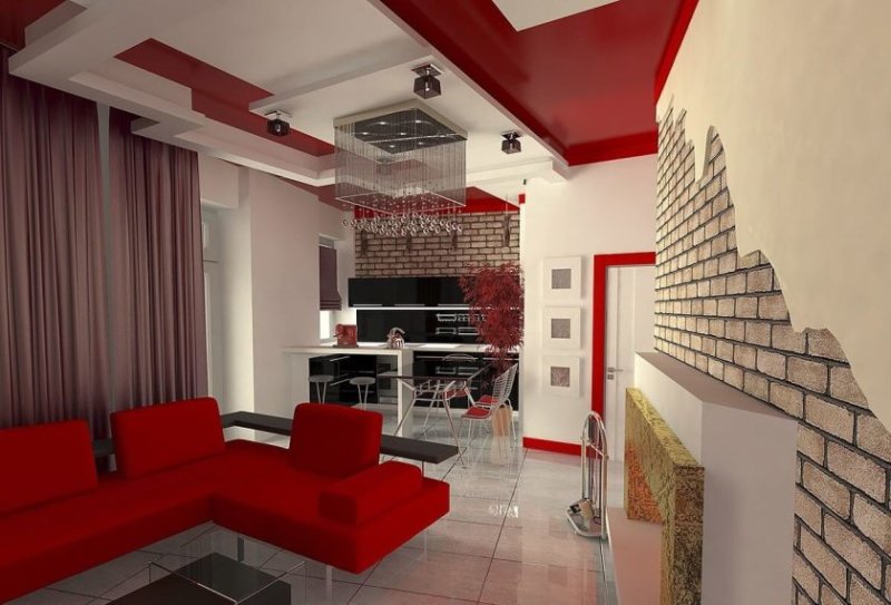
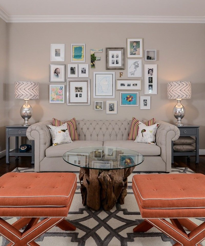
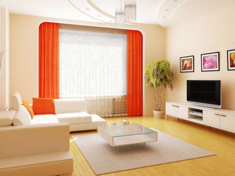
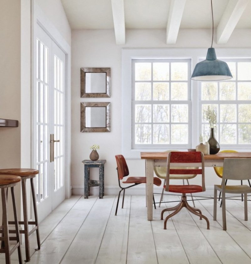
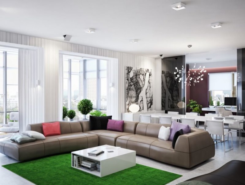
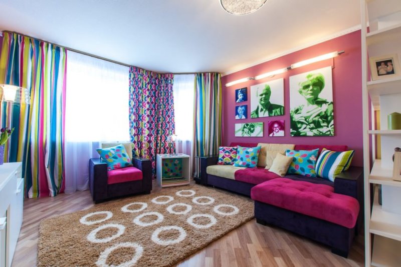
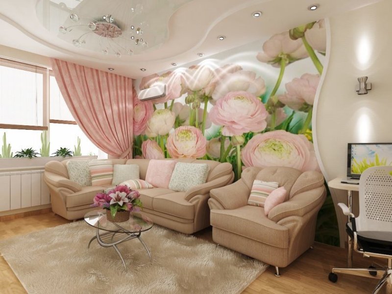
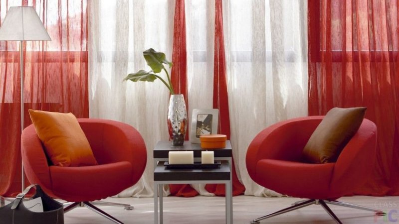
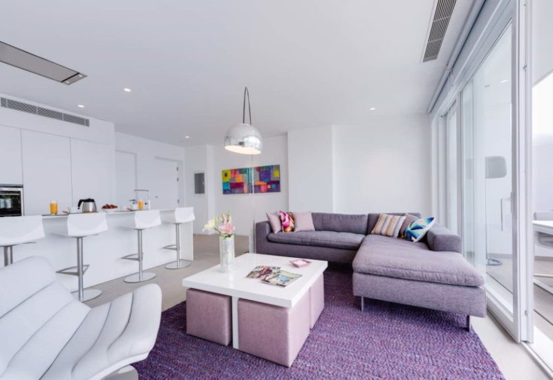
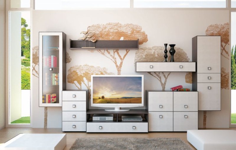
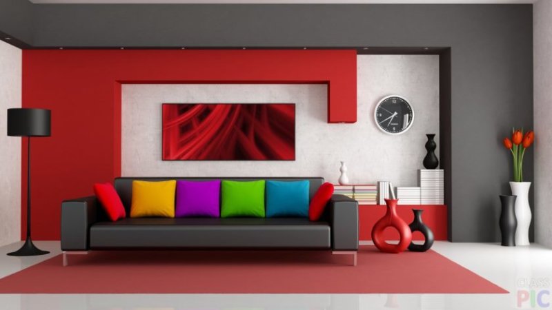
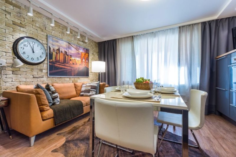
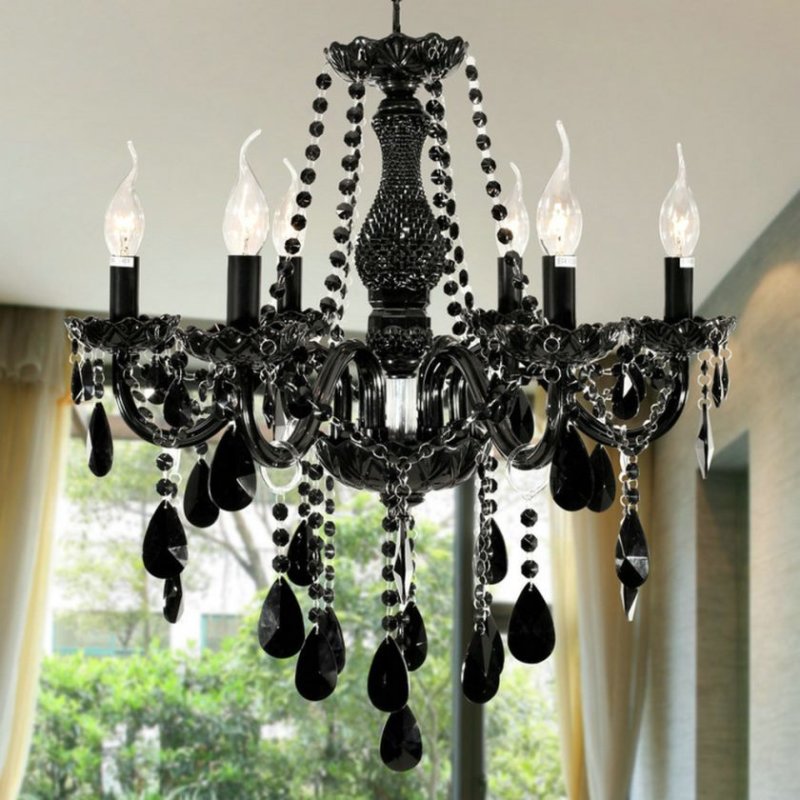
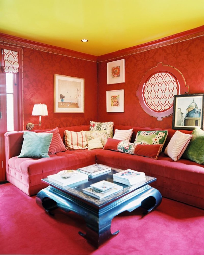
- Red color - possible if the living room is decorated in different colors, as shown in the photo. Such a colorful and pronounced color should be diluted with furniture of a different shade.
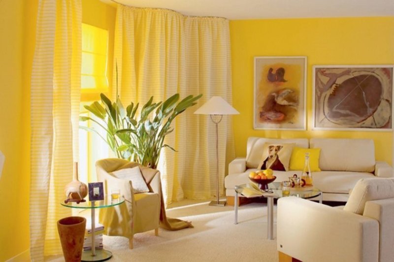
- Yellow is the main principle, as with red, it is important to know the measure.
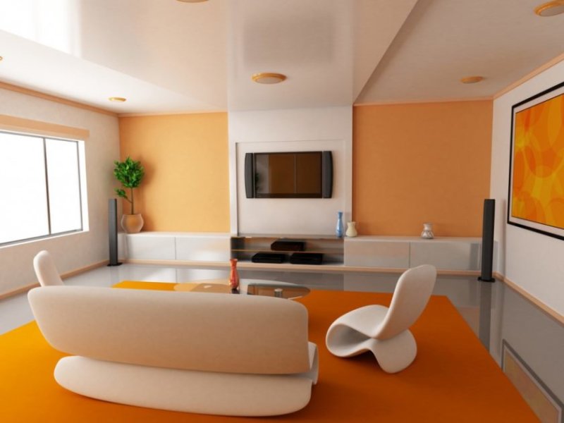
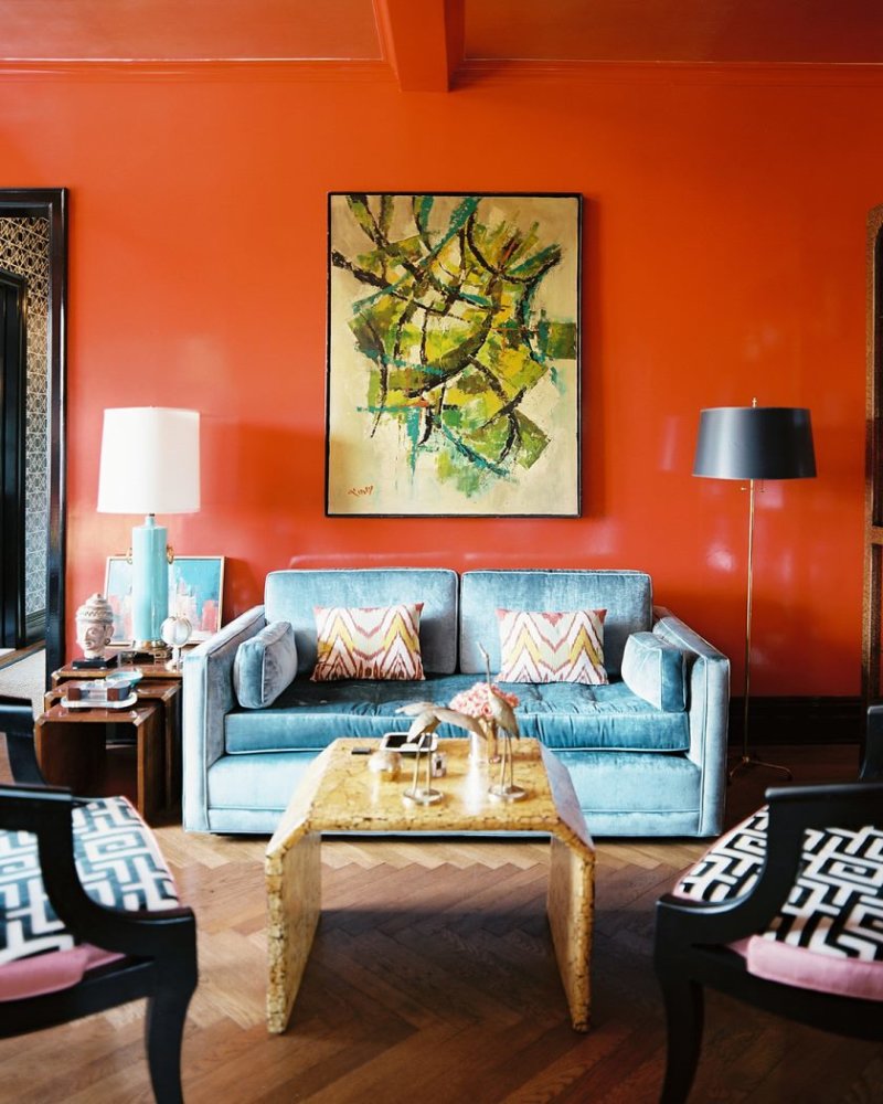
- Orange color is an ideal fragmentary decoration of the living room walls for people who prefer the classic style.
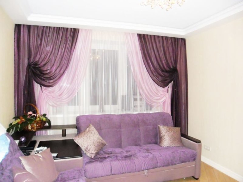
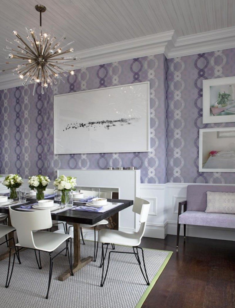
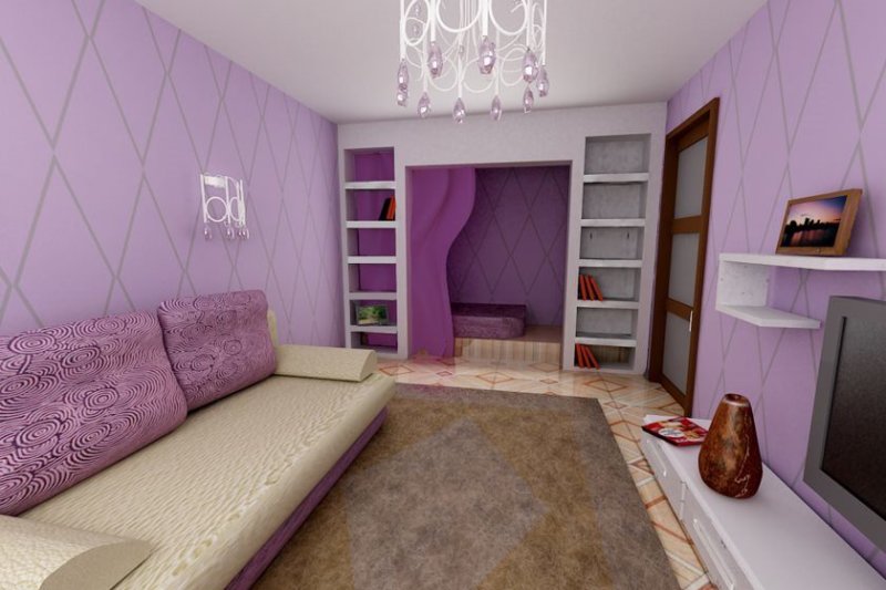
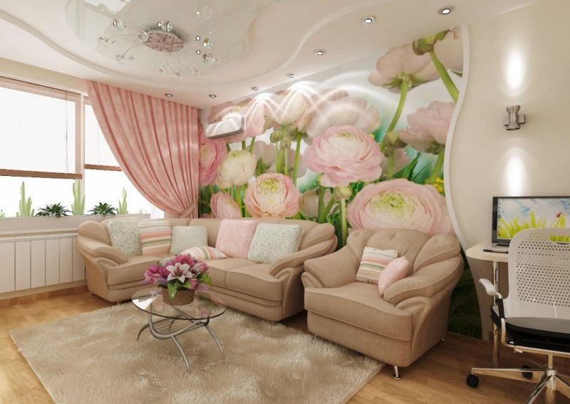
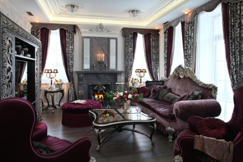
- Lilac color is ideal for windows facing the south side. Do your windows face north? Use this color in minimal quantities so as not to give the living room a gloomy look.
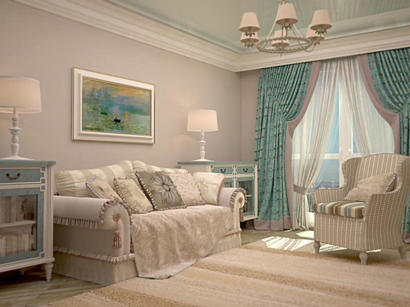
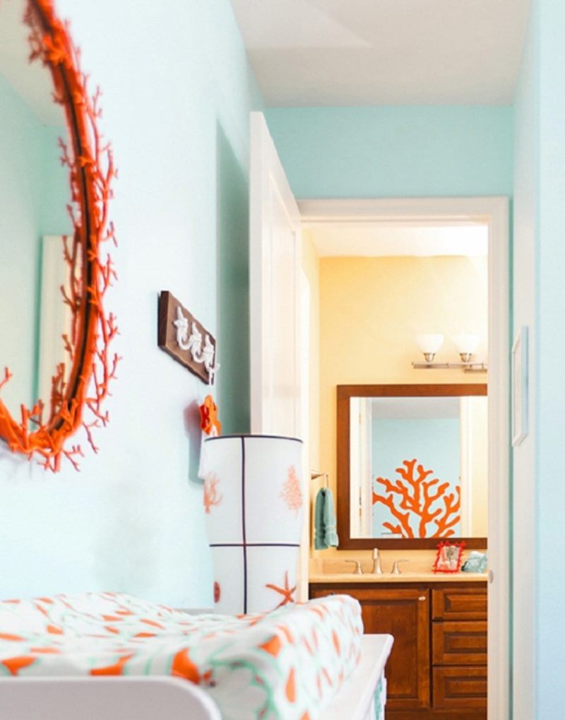
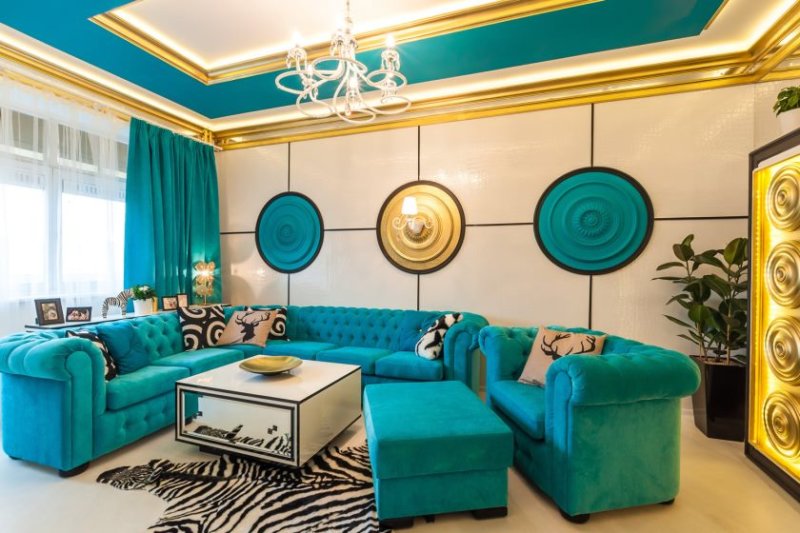
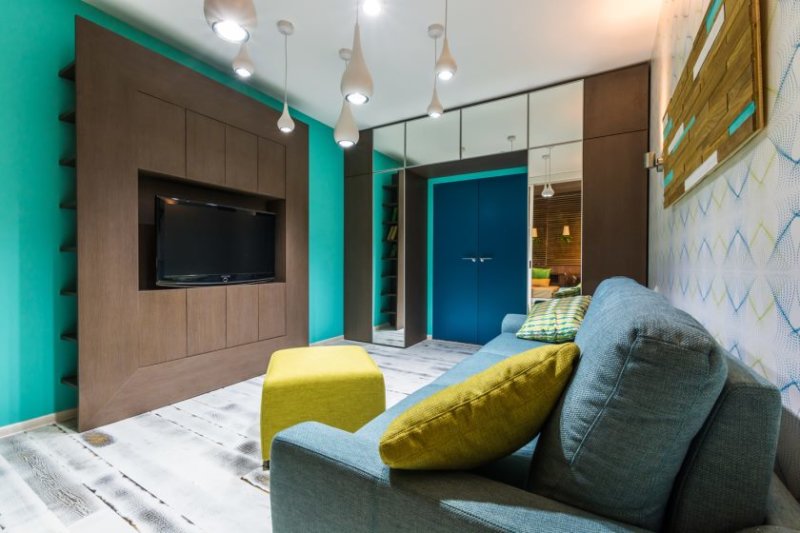
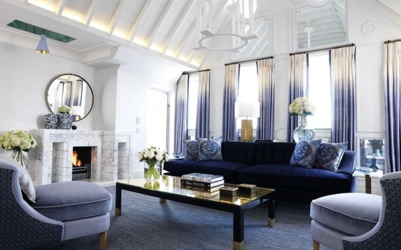
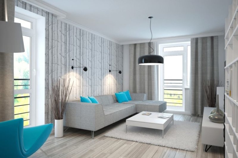
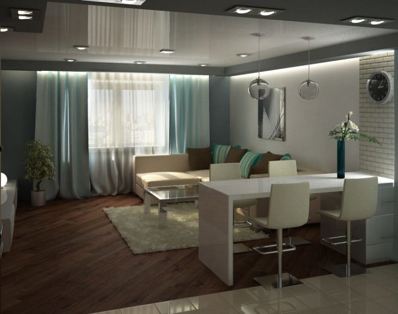
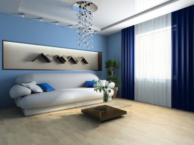
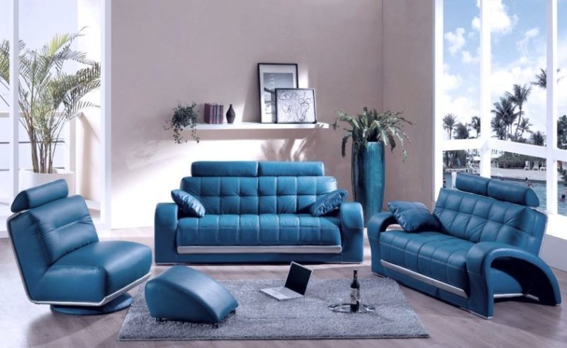
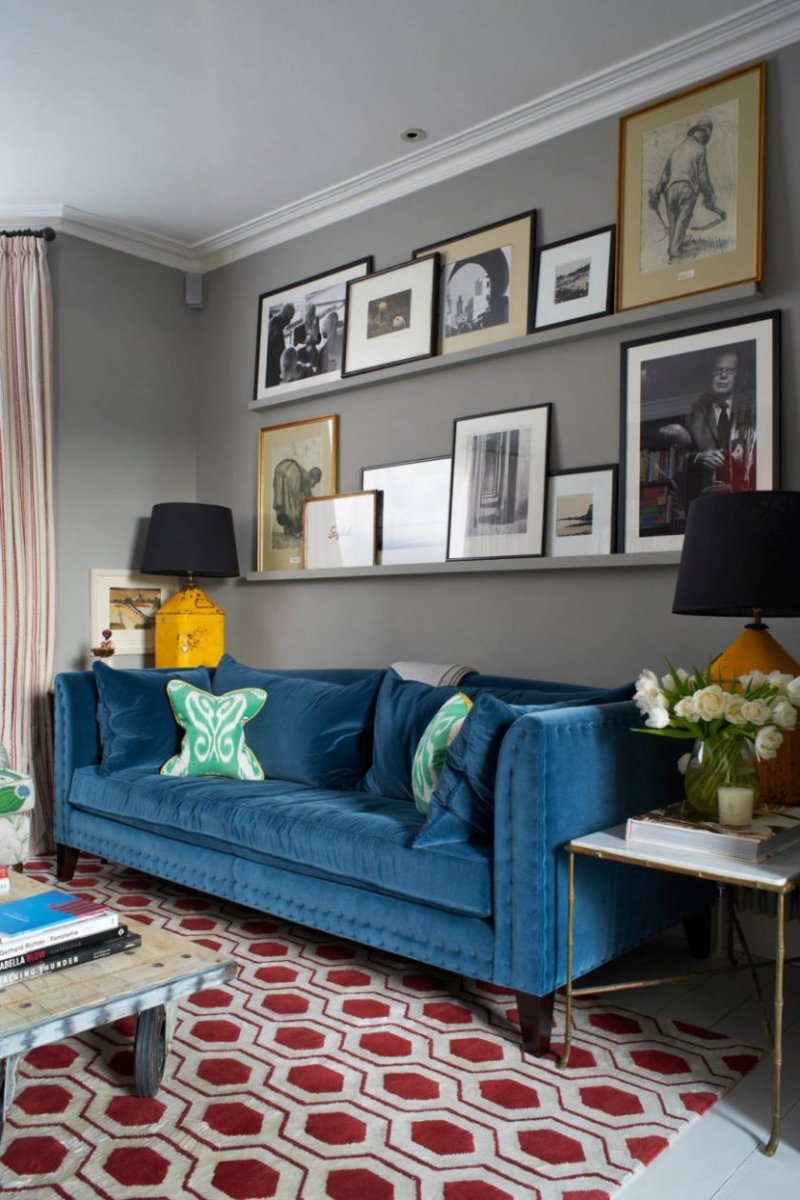
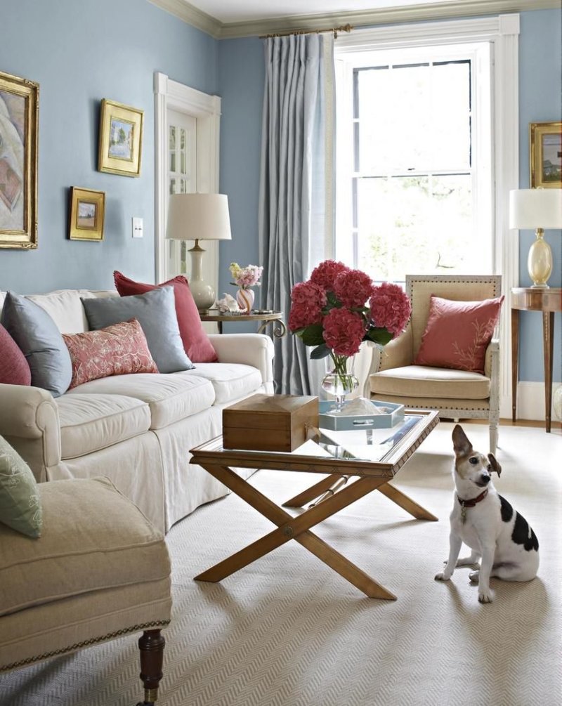
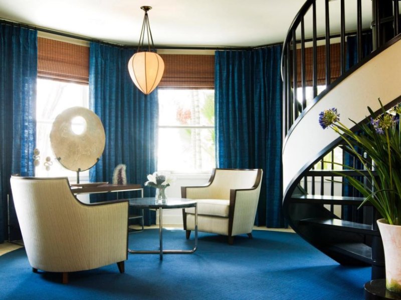
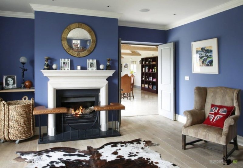
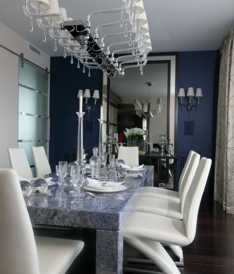
- Blue color - the same recommendations apply to it as to lilac.

Zoning by playing with color and other devices
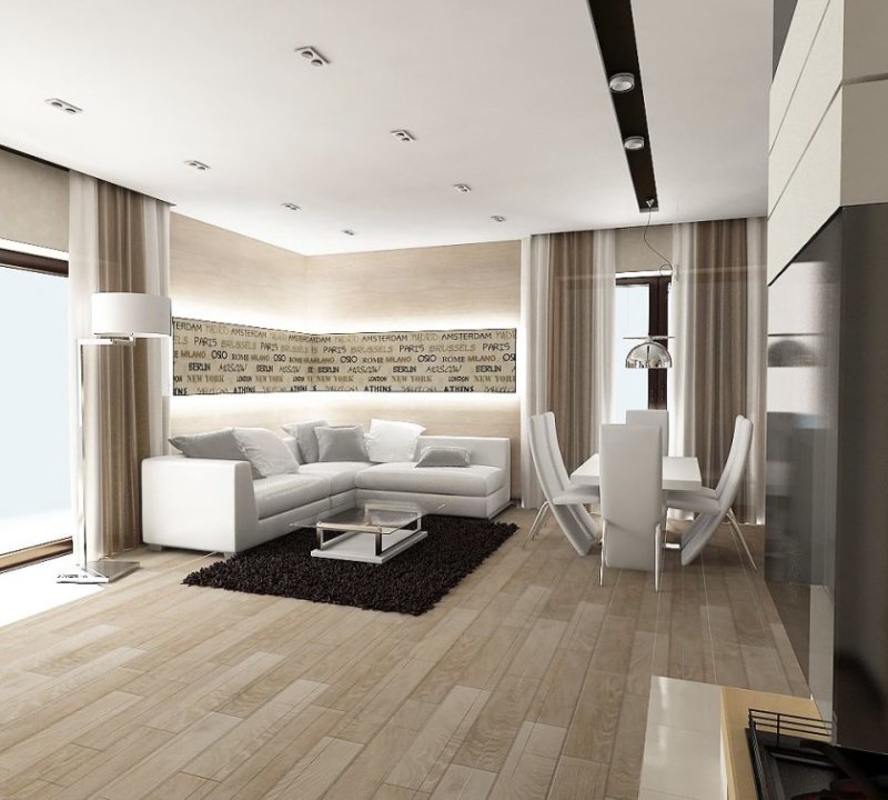
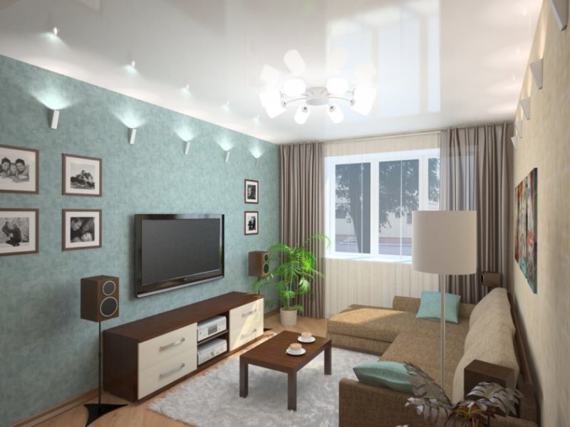
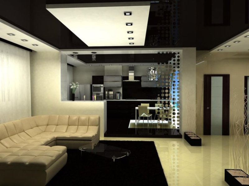
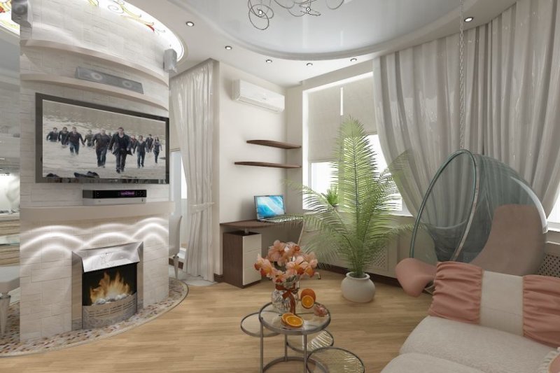
If the color of the living room is sustained in one tone, as can be seen in the photo - we highlight the place for rest in a different shade, without sharp transitions. To highlight a specific area, it is not necessary to resort to a change in the color of the walls of the room, it is enough just to use the picture.

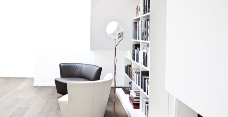
Also, for zoning, artificial light sources are ideal, it can be either lamps or floor lamps or the same sconces, and it does not matter what particular color you chose for the living room.

Another ideal option to focus on the relaxation area is easy to implement, in the presence of large floor indoor plants, regardless of the colors used in the living room.

Recommendations that help to perfectly combine different colors while maintaining a sense of taste and style
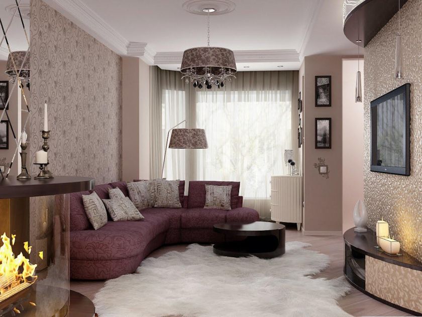
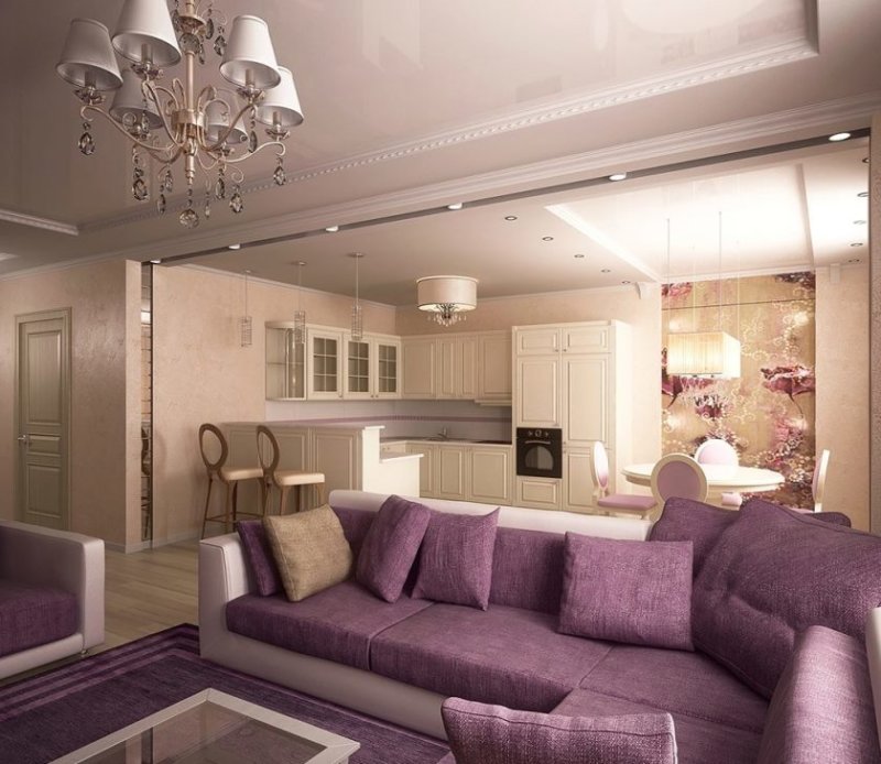
- The combination of brown and beige tones must be diluted with black, but again you need to know the measure, it should be very little.
- The combination of red and green is hardly possible, because both of them are very bright, muted shades are suitable as an option.
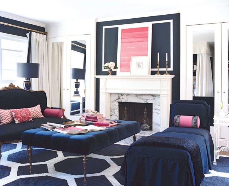
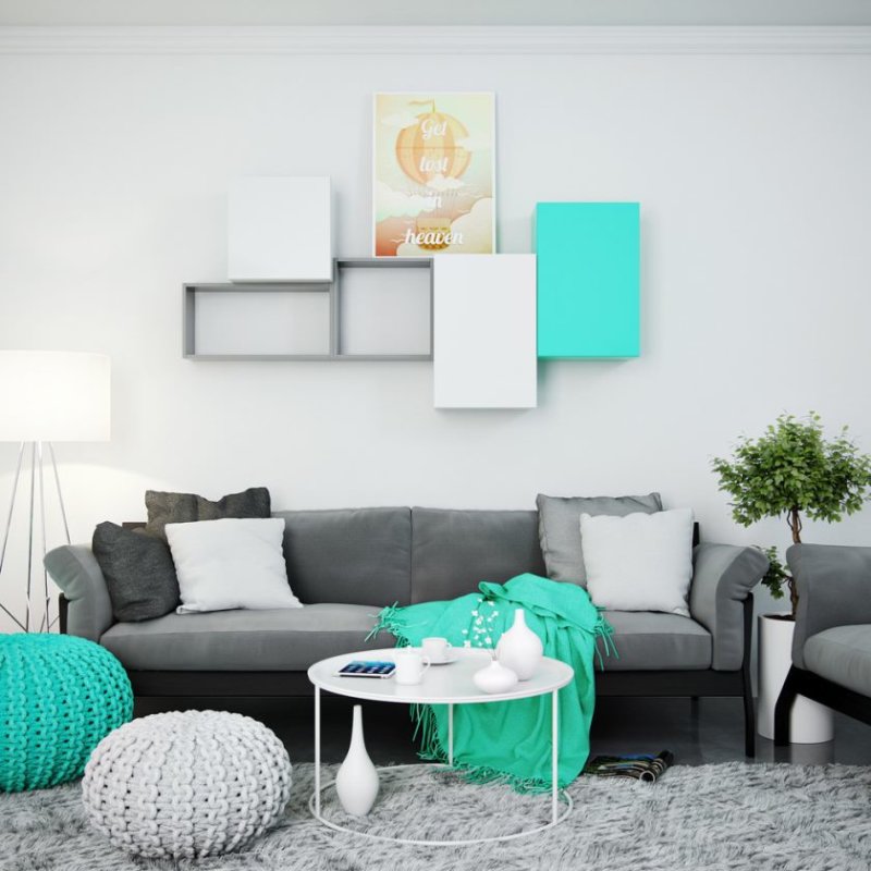
- The combination of blue and white - well, here is just a flight of your imagination, since these shades are in perfect harmony with each other.
- The combination of black and lilac is highly recommended not to be used together.
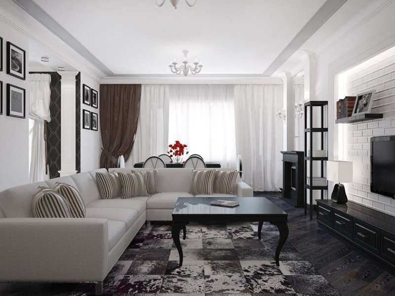
The final conclusion of these recommendations is as follows: - when decorating the living room in different colors, you should carefully approach this issue and then everything will turn out beautifully, aesthetically and stylishly, as shown in the photo.
Also read:
Interior design of a modern living room - 120 photos of ideas and novelties of arrangement
Living Room Furniture - 150 photos in the interior
Living Room Design - 200 photos of the best interiors in the living room
Wall in the living room - 100 photos of beautiful walls for the living room
Design of the living room bedroom: how to correctly divide 2 interiors (100 photos)
Kitchen living room - 105 of the best photos in the interior of the kitchen combined with the living room
Modular living room - 75 photos of ideas for interior design
White living room - 55 photos of the arrangement of the living room in white
Small living room - 100 photos of interior design (7 ideas)
Interior design of the living room - 10 tips for arranging the living room (75 photos)
Classic style living room - 57 photos in the interior
Zoning the living room - the best ideas and options for zoning (115 photos)
Walls in the living room - 100 photos of a beautiful wall design in the interior
140 photos of perfectly matched color in the living room interior


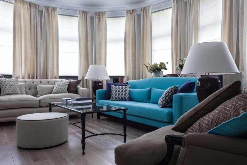

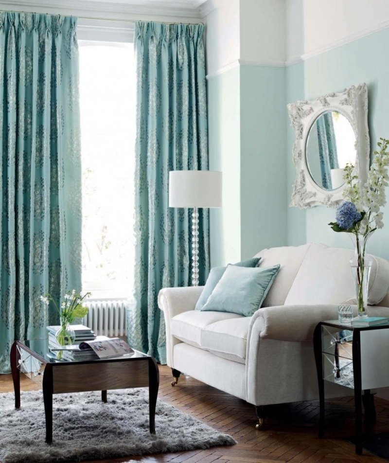


The turquoise color in the interior is just super !!! I want it !! It’s good that I’m still in the stage of ideas and projects, they planned to start the repair after the holidays. So I would have done a neat but fresh interior, if not for this article))). I directly discovered turquoise on a white background. And how many options can be drawn from each of the best and to draw up your own project as a result. Now, now I already see in my thoughts my future living room, super !!
How much I love green gardens! In order not to have an ideal order, but the garden looked neglected))) I really liked the article - a huge selection of different shrubs. It would only be much better if they indicated to each type of shrub in which climate it grows. Unfortunately for our climate zone, the choice is very limited ((((especially with bright and large colors.
Great article, thanks! But besides color, the quality of the paint is also important, for example, I am looking for wear-resistant to serve for a long time (they advise snow to platinum modern), and using tinting, you can practically make any shade! I personally love beige in combination with pistachio)